How to Create a Group Landing Page Template
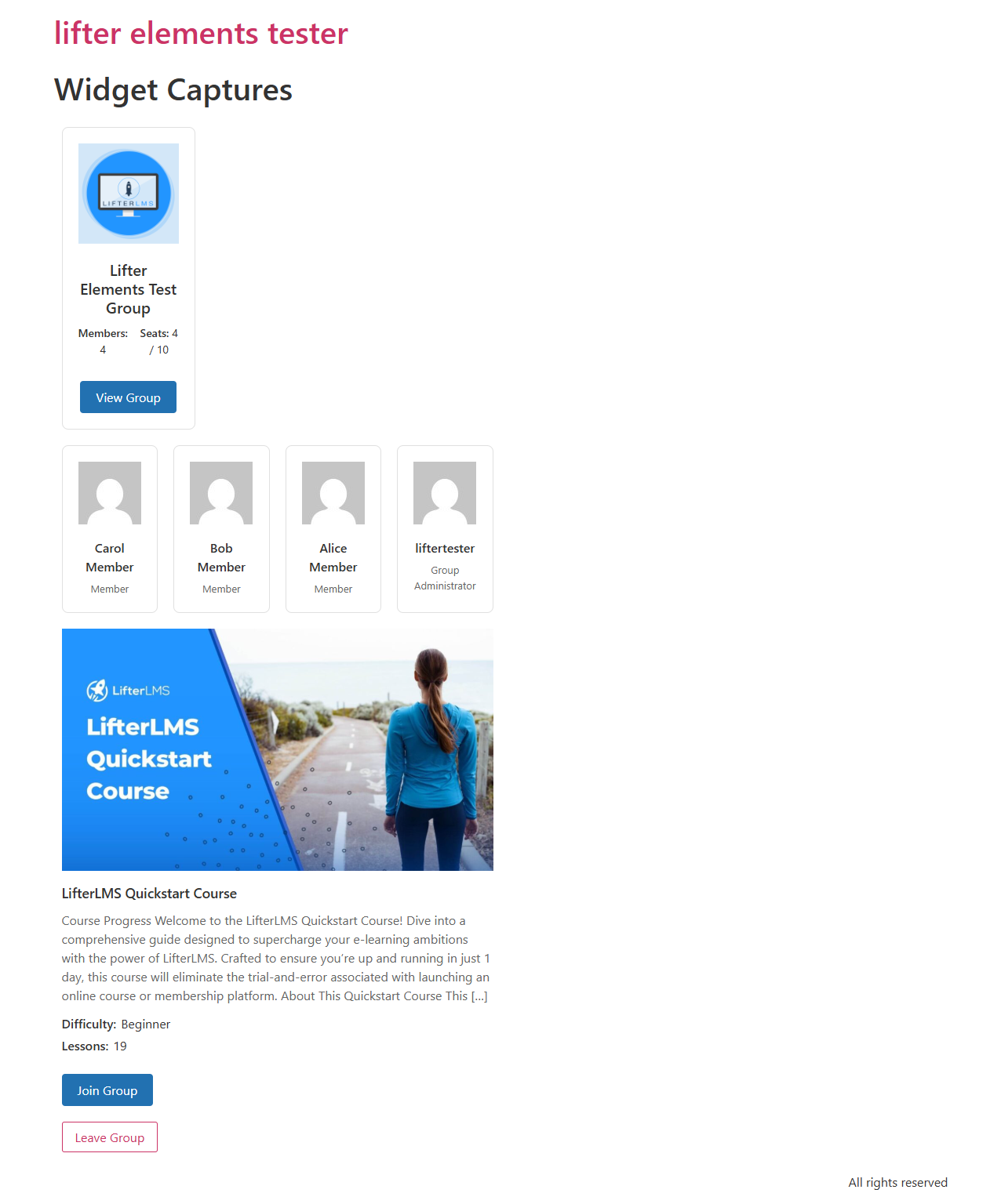
Build a single Elementor Theme Builder template that renders for every group on your site, using the five Lifter Elements Groups widgets and two Groups dynamic tags. Each group page then shows its own banner, logo, name, course card, member grid, invite link, and leave button without editing individual group posts.
- Lifter Elements with LifterLMS Groups installed and activated
- Elementor Pro (required for Theme Builder)
- At least one group with a banner, logo, members, and a linked course (see the LifterLMS Groups documentation)
1. Create the Theme Builder template
- From the WordPress admin, go to Templates > Theme Builder.
- Click Add New at the top of the screen.
- For Template Type, choose Single Post.
- Give the template a name (for example Group Page Template) and click Create Template.
When the Elementor editor opens, it offers to insert a template from the library. Close that dialog to start with an empty canvas.
2. Build a hero with banner, logo, and name
The hero identifies which group the visitor is viewing.
- Drag a new container (or section) onto the canvas with a single-column structure.
- In its settings, open the Style tab > Background > Background Type: Classic.
- Click the Background Image dynamic-tag icon and choose Group Banner from the LifterElements: Groups group. The background now pulls from the current group's banner image.
- Set Min Height to about 320px.
Inside the column:
- Drop an Image widget. On its Content tab, click the dynamic-tag icon next to Image and select Group Logo. Constrain the width to about 120px so it displays as a badge.
- Drop a Heading widget below it. Click the dynamic-tag icon next to Title and select Group Name. Set the heading size to XXL and the text color to white for contrast against the banner.
Every group page now renders its own banner, logo, and name.
Add a sub-heading bound to the Group Visibility dynamic tag to show whether the group is Open, Private, or Closed.
3. Add the course card
- Drop a new single-column section below the hero.
- Inside it, drop the Group Page Course Card widget.
- Leave Use Current Group set to Yes (the default). The widget resolves to whichever group post is being rendered.
The widget detects whether the linked content is a course or a membership and shows the relevant meta (difficulty and lesson count for courses; nothing extra for memberships).
4. Add the members grid
- Drop another section below the course card.
- Drop the Group Members widget into it.
- Leave Use Current Group set to Yes.
- On the Content tab, set Members to Show to a cap that suits your layout (for example 12).
- On the Style tab, adjust avatar size, card spacing, and column count to match your site.
5. Add the invite and leave buttons
- Drop a new section with a two-column structure.
- In the left column, drop the Group Invitation Link widget. Set the button text to Join this Group.
- In the right column, drop the Leave Group widget. Style its button with a warning color so it is clearly distinct from the primary button.
Both widgets are safe to leave visible to everyone:
- The invite button only renders when the group has an open invitation link enabled (see Troubleshooting).
- The leave button only renders for users whose role in the group is
member; admins and leaders do not see it.
To hide the whole button section from non-members, open the section's Advanced tab > Conditional Logic, click Open Conditional Logic Settings, and add the rule User Group Enrollment is Enrolled in current group. The section then shows only to existing members.
6. Set display conditions
- Click the publish settings arrow next to the green Publish button at the bottom of the panel.
- In Conditions, click Add Condition.
- Set Include > Singular > Groups (the
llms_grouppost type). - To apply the template to all groups, leave the third dropdown at All Groups; to target one group, pick it from the list.
- Click Save & Close, then Publish.
The template is now active for every group post matching the condition.
Result
Visit any group's URL on the front end (typically /group/<slug>/), logged out for a public group or as a member for a private one. The page renders the banner, logo, name, course card, members, and action buttons populated from that group's data.
If the page renders without the group's data (only default placeholder content), see Troubleshooting. The usual causes are a missing display condition or LifterLMS Groups not being active.
- Personalize by role: bind a Heading widget to the Current User Group Role dynamic tag for a "Welcome, Leader" or "Welcome, Member" greeting. The tag returns empty for logged-out visitors and non-members.
- Add a leader-only sidebar: see How to Create a Leader-Only Sidebar, which uses the User Group Role condition.
- Show a "Group is full" message: add a section with that heading and gate it with Group Seat Availability is Current group has no open seats; gate the invite section the opposite way so visitors see one or the other.