Group Page Course Card
Group Page Course Card
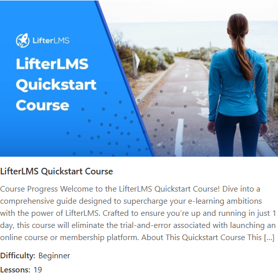
The Group Page Course Card widget displays the course or membership that a LifterLMS Group is linked to as a card: thumbnail, title, excerpt and, for courses only, the difficulty and lesson count. It appears in the Elementor panel under the Lifter Elements - Groups category.
This widget is registered only when the LifterLMS Groups add-on is installed and active alongside Lifter Elements.
Usage
Group landing template — Add the widget to a Theme Builder single template for the llms_group post type and leave Use Current Group on. Every group page then shows its own linked course or membership. See Create a Group Landing Template.
Promote one group's course anywhere — Turn Use Current Group off and pick a group under Group to show that group's course card on a regular page, such as a company intranet or a course sidebar.
Piece-by-piece layouts — If you need the same data in your own layout rather than a single card, use the Group Course Title, Group Course URL and Group Course Image dynamic tags with standard Elementor widgets instead.
How it works
The widget resolves the group, reads the course or membership it is linked to, and detects the post type. The output is the same for every visitor; it does not show the viewer's enrollment or progress.
| Situation | Behaviour |
|---|---|
| Rendered outside a group page with Use Current Group on (a normal page, or a course page) | Renders nothing. |
| The group has no linked course or membership | Renders nothing. |
| The group is linked to a membership | Shows thumbnail, title and excerpt only; Show Difficulty and Show Lesson Count are ignored. |
| The linked post has no featured image or no excerpt | That element is skipped; the rest of the card still renders. |
| The course has no difficulty term | The Difficulty row is skipped. |
| Link to Course is on | The thumbnail and title link to the course or membership page. |
Difficulty renders as Difficulty: followed by the course's first difficulty term; the lesson count renders as Lessons: followed by the number of lessons in the course.
Settings
Content
| Setting | Description |
|---|---|
| Use Current Group | Yes (default) uses the group whose page is being viewed, the normal choice on a group template. No reveals the Group setting. |
| Group | Pick a specific LifterLMS Group. Shown only when Use Current Group is No. |
| Show Thumbnail | Shows the course or membership featured image at the top of the card. Default Show. |
| Show Title | Shows the course or membership title. Default Show. |
| Show Excerpt | Shows the course or membership excerpt. Default Show. |
| Show Difficulty | Shows the course difficulty term. Only renders when the linked post is a course. Default Show. |
| Show Lesson Count | Shows the number of lessons in the course. Only renders when the linked post is a course. Default Show. |
| Link to Course | Yes (default) links the thumbnail and title to the course or membership page. No renders them as plain elements. |
Style
| Section | Description |
|---|---|
| Card | Background Color, Border, Border Radius, Box Shadow and Padding for the card container. |
| Thumbnail | Height (50 to 600 px), Object Fit (Default / Contain / Cover / Fill) and Alignment (Left / Center / Right) of the featured image. Shown only when Show Thumbnail is on. |
| Title | Typography, Color and Hover Color for the title. Hover Color applies when Link to Course is on. Shown only when Show Title is on. |
| Excerpt | Typography and Color for the excerpt. Shown only when Show Excerpt is on. |
| Meta | Label Typography, Label Color, Value Typography and Value Color for the difficulty and lesson-count rows. Shown only when Show Difficulty or Show Lesson Count is on. |
Advanced
The Advanced tab holds Elementor's own layout, motion, responsive and custom-CSS controls; see Elementor's documentation. Lifter Elements adds one section, Conditional Logic, which shows or hides this widget by the visitor's LifterLMS status; see the Conditional Logic reference.
Notes
- The card shows the same content to every visitor. To show a member's own progress in the linked course, use the Course Progress widget on the course page itself.
- Related group widgets: Group Members, Group Invitation Link, Leave Group, Groups List.