Groups List
Groups List
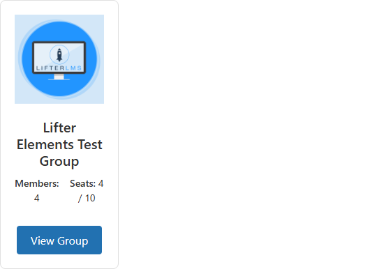
Lists published LifterLMS Groups in a grid of one to six columns. Each card can show the group's banner, logo, title, excerpt, member count, seat count and a button to the group page. You can list every group, only groups with a given visibility (Open, Private or Closed), or only the groups the current visitor belongs to. The widget sits under the Lifter Elements - Groups category of the Elementor panel and works on any page or template.
This widget is registered only when the LifterLMS Groups add-on is installed and activated alongside Lifter Elements.
Usage
Public groups directory — Drop the widget on a page and keep Visibility on All Groups, or set it to Open Only so visitors only see groups they can join. Pair it with the Group Invitation Link widget on the group page itself so visitors can join once they land there.
"My groups" block on a dashboard — Set Visibility to Enrolled Only. Each logged-in student sees only the groups they belong to; a visitor who is not logged in sees the Empty Message instead. Turn Show Seat Count off for this use, since seats matter to leaders rather than members.
Leader overview — Keep Show Member Count and Show Seat Count on so group leaders can see how full each group is at a glance, and link to a group template that uses the Group Members widget for the full roster.
Single-group data — To print one group's name, logo, counts or URL inside your own layout rather than a list, use the Groups dynamic tags.
How it works
The widget runs a standard WordPress query for published groups, ordered by Order By and Order, and prints one card per result. Visibility either adds a meta filter on the group's visibility setting or, for Enrolled Only, restricts the query to the groups the current student is enrolled in (whatever their role in the group).
| Situation | Behaviour |
|---|---|
| Visibility is Enrolled Only and the visitor is not logged in | The widget prints the Empty Message in a paragraph and nothing else. |
| Visibility is Enrolled Only and the logged-in user belongs to no groups | The query returns nothing, so the Empty Message is printed. |
| No group matches the filter (for example no group is set to Closed) | The Empty Message is printed. |
| Visibility is All Groups, Open Only, Private Only or Closed Only | The list is the same for every visitor, logged in or not; the visibility setting is used as a filter only, not as an access check. Use Conditional Logic to hide the widget from visitors who should not see it. |
| Group has no banner or no logo | The banner and logo elements are skipped for that card even when their Show switch is on. |
| Group has no excerpt | The excerpt element is skipped for that card. |
| Show Member Count and Show Seat Count are both off | The meta block is left out of the card entirely. |
Card titles and buttons link to the group's page. Member count is the group's current number of members; seat count prints used and total seats as used / total.
Settings
Content
| Setting | Description |
|---|---|
| List All Results | Yes (default) lists every group that matches the filter. No reveals Number of Groups. |
| Number of Groups | Maximum number of groups to print, 1 to 100. Default 10. Shown only when List All Results is No. |
| Columns | Cards per row, 1 to 6, per device. Defaults: 3 on desktop, 2 on tablet, 1 on mobile. |
| Order By | Sort key: Title (default), Date (publish date), Last Modified, Menu Order or Random. |
| Order | Ascending (default) or Descending. |
| Visibility | Which groups to list. All Groups (default) lists every published group. Enrolled Only lists the groups the current user belongs to. Open Only, Private Only and Closed Only list groups whose LifterLMS Groups visibility setting matches. See How it works. |
| Show Logo | Show (default) prints the group logo above the title. |
| Show Banner | Show prints the group banner image at the top of the card. Default Hide. |
| Show Title | Show (default) prints the group title as a link to the group page. |
| Show Excerpt | Show (default) prints the group excerpt. |
| Show Member Count | Show (default) prints Members: followed by the number of members. |
| Show Seat Count | Show (default) prints Seats: followed by the used and total seat numbers, for example 4 / 10. |
| Show Button | Show (default) prints a button linking to the group page and reveals Button Text. |
| Button Text | Label of the card button. Default View Group. Shown only when Show Button is Show. |
| Empty Message | Text printed when no groups match. Default No groups found. |
Style — Card
| Setting | Description |
|---|---|
| Background Color | Background of each group card. |
| Border / Border Radius / Box Shadow | Elementor's border, corner-rounding and shadow controls for the card. |
| Padding | Inner spacing of the card, in px, em or %. |
| Gap Between Cards | Space between cards in the grid, 0 to 60 px. Default 20. |
Style — Logo (shown only when Show Logo is Show)
| Setting | Description |
|---|---|
| Height | Height of the logo image, 20 to 300 px. |
| Object Fit | How the logo scales inside that height: Default, Contain, Cover or Fill. |
| Alignment | Left, Center or Right. |
Style — Title (shown only when Show Title is Show)
| Setting | Description |
|---|---|
| Typography | Font settings for the title. |
| Color / Hover Color | Title link colour in its normal and hovered states. |
Style — Excerpt (shown only when Show Excerpt is Show)
| Setting | Description |
|---|---|
| Typography / Color | Font settings and text colour of the excerpt. |
Style — Meta (shown only when Show Member Count or Show Seat Count is Show)
| Setting | Description |
|---|---|
| Label Typography / Label Color | Font settings and colour of the Members: and Seats: labels. |
| Value Typography / Value Color | Font settings and colour of the numbers that follow them. |
Style — Button
| Setting | Description |
|---|---|
| Typography | Font settings for the button label. |
| Normal / Hover | Text Color and Background Color for each state of the button. |
| Border / Border Radius / Padding | Border, corner rounding and inner spacing of the button. |
Advanced
The Advanced tab holds Elementor's own layout, motion, responsive and custom-CSS controls; see Elementor's documentation. Lifter Elements adds one section, Conditional Logic, which shows or hides this widget by the visitor's LifterLMS status; see the Conditional Logic reference.
Notes
- Enrolled Only does not distinguish roles: members, leaders and admins all count as enrolled. To show content to leaders only, use the User Group Role condition in Conditional Logic.
- The card markup uses
legi-classes (.legi-groups-list-grid,.legi-group-card,.legi-group-title,.legi-group-button) for custom CSS. - Related: Group Members, Group Invitation Link, Leave Group, Groups dynamic tags, Create a Group Landing Template.