Group Members
Group Members
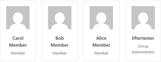
Lists the members of a LifterLMS group in a grid of one to six columns. Each card shows the member's avatar, display name and group role, and you can switch any of the three off. The widget reads the group from the page it sits on, or from a group you pick in the panel, and sits under the Lifter Elements - Groups category of the Elementor widget panel.
This widget is registered only when the LifterLMS Groups add-on is active alongside Lifter Elements.
Usage
Member roster on a group page — Add the widget to an Elementor Theme Builder template for the group post type (see Create a Group Landing Template) and leave Use Current Group on Yes. Every group that uses the template lists its own members. Pair it with the Group Member Count dynamic tag in a heading for a "12 members" caption.
Leaders-only roster — Put the widget in a section that only leaders and admins see, using the User group role condition on the section's Advanced tab (see Create a Leader-Only Sidebar). The widget itself renders the same grid for every visitor, so conditional logic is how you hide it from ordinary members or from visitors outside the group.
Featured cohort on a marketing page — Set Use Current Group to No and pick a group under Group to show one group's members on any page, for example a "meet the current cohort" block. Combine with Show Role set to Hide if the roles are not meaningful to prospects.
Groups directory — To list groups rather than the people in one group, use the Groups List widget.
How it works
The widget asks LifterLMS Groups for the group's members with an active enrollment and prints one card per member, up to the Members to Show limit. It does not check who is viewing: a visitor who can open the page sees the grid, whatever their group role or whether they belong to the group at all. Restrict the page with the group's visibility setting in LifterLMS Groups, or the widget with Conditional Logic.
| Situation | Behaviour |
|---|---|
| Use Current Group is Yes on a single group page or a Theme Builder template for the group post type | Members of the group being viewed are listed. |
| Use Current Group is Yes anywhere else | No group can be found, so the widget prints the text "No group specified." instead of a grid. Switch to No and pick a Group on ordinary pages. |
| Use Current Group is No and no Group is chosen | Prints "No group specified." |
| The group has no members with an active enrollment | Prints the Empty Message text (default "No members found."). Removed, cancelled or expired members are not counted. |
| The group has more members than Members to Show | Only the first batch is listed; there is no pagination. Raise Members to Show (maximum 100) to list more. |
| Show Role is Show but a member has no role recorded | The card prints without a role line. |
| The visitor is a leader, admin, member or non-member | The grid is identical for all of them. |
Role labels come from LifterLMS Groups: Member, the leader name set in the add-on's settings (default Leader), and the group name plus Administrator (default Group Administrator).
Settings
Content
| Setting | Description |
|---|---|
| Use Current Group | Yes (default) lists the members of the group whose page is being viewed. No reveals the Group drop-down so you can choose a group by hand. |
| Group | Drop-down of published groups. Shown only when Use Current Group is No. |
| Members to Show | How many members to print, from 1 to 100. Default 10. |
| Columns | Cards per row, from 1 to 6, set per device. Defaults: 4 on desktop, 2 on tablet, 1 on mobile. |
| Show Avatar | Show (default) prints the member's WordPress avatar at the top of the card; Hide leaves it out and hides the Avatar style section. |
| Show Name | Show (default) prints the member's display name; Hide leaves it out and hides the Name style section. |
| Show Role | Show (default) prints the member's role in this group under the name; Hide leaves it out. |
| Empty Message | Text printed when the group has no members. Default "No members found." |
Style — Card
| Setting | Description |
|---|---|
| Background Color | Background of each member card. The stylesheet's default is white with a light grey border and rounded corners. |
| Border / Border Radius / Box Shadow | Elementor's border, corner-rounding and shadow controls for the card. |
| Padding | Inner spacing of the card in px, em or %. Default 20px all round. |
| Gap Between Cards | Space between cards in the grid, 0 to 60 px. Default 20. |
Style — Avatar (shown only when Show Avatar is Show)
| Setting | Description |
|---|---|
| Size | Width and height of the avatar image, 20 to 200 px. The stylesheet's default is 80px. |
| Object Fit | How the image fills its box: Default, Contain, Cover or Fill. The stylesheet's default is cover. |
| Border Radius | Corner rounding of the avatar in px or %. The stylesheet's default is 50%, a circle. |
| Alignment | Left, Center or Right placement of the avatar inside the card. Cards are centred by default. |
Style — Name (shown only when Show Name is Show)
| Setting | Description |
|---|---|
| Typography | Elementor's typography group for the member name. |
| Color | Text colour of the member name. |
Advanced
The Advanced tab holds Elementor's own layout, motion, responsive and custom-CSS controls; see Elementor's documentation. Lifter Elements adds one section, Conditional Logic, which shows or hides this widget by the visitor's LifterLMS status; see the Conditional Logic reference.
Notes
- The role line has no style section of its own. It inherits the card's text styling; to restyle it, target
.legi-member-rolein the Custom CSS section of the Advanced tab. - Card markup uses the classes
.legi-group-members-grid,.legi-member-card,.legi-member-avatar,.legi-member-nameand.legi-member-role. The column breakpoints are fixed in the widget stylesheet at 1024px (tablet) and 767px (mobile). - Related: Groups List, Group Page Course Card, Group Invitation Link, Leave Group, Groups dynamic tags (including Current User Group Role), Group conditions.