Widgets - Groups List
Overview
The Groups List widget displays a directory of LifterLMS Groups as a styled card grid. Each card shows the group's logo, title, excerpt, member and seat counts, and a button linking to the group page. You can filter the listing by visibility (Open, Private, Closed), by current-user enrollment ("My Groups"), or show all published groups.
This widget is most often used on a dedicated Groups directory page, on a member dashboard, or in a sidebar showing the user's enrolled groups.
This widget is available when the LifterLMS Groups add-on is installed and activated alongside Lifter Elements. Without LifterLMS Groups, the widget is not registered.
Getting to know the widget
In the Elementor widget panel, look for the Groups List tile under the Lifter Elements - Groups category:

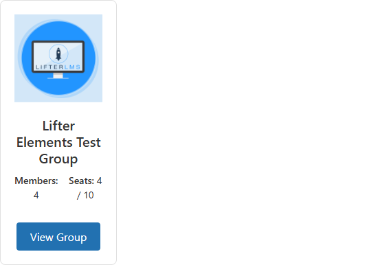
Dropped into a page or template, the widget renders a directory grid of group cards — each with a logo, member count, seat count, and "View Group" button:
Content Tab

Content Section
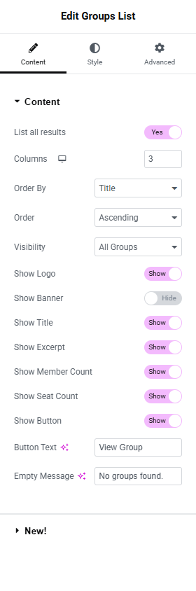
List all results
- Toggle Switch:
- On (default): The widget returns every group matching the visibility filter, with no upper limit.
- Off: A Number of Groups field appears below, allowing you to cap the listing.
Number of Groups
Only shown when "List all results" is Off.
- Number field: The maximum number of groups to render. Default
10, range1to100.
Columns
Controls how many cards appear per row.
- Device icon: For selecting which viewpoint you're editing the settings for. More details can be found here.
- Desktop: Default
3 - Tablet Portrait: Default
2 - Mobile Portrait: Default
1
- Desktop: Default
- Number field: Range
1to6. Sets a CSS classlegi-groups-list-cols<device>-<n>on the widget wrapper, which the stylesheet uses to set the grid layout.
Order By
Determines how the groups are sorted.
- Dropdown Selector
- Title (default): Alphabetical by group title
- Date: By group creation date
- Last Modified: By most recent edit
- Menu Order: By the WordPress menu_order field on the group post
- Random: Randomized order on every page load
Order
Sets the direction of the sort.
- Dropdown Selector
- Ascending (default)
- Descending
Visibility
Filters the listing by group visibility setting or enrollment state.

- Dropdown Selector
- All Groups (default): Every published group
- Enrolled only: Limits to groups the currently logged-in user is enrolled in (as member, leader, or admin). Equivalent to a "My Groups" listing. Logged-out users will see the Empty Message.
- Open only: Only groups whose visibility is set to Open
- Private only: Only groups whose visibility is set to Private
- Closed only: Only groups whose visibility is set to Closed
Use the Enrolled only option to build a "My Groups" panel for a student dashboard — no separate widget needed.
Show Logo / Banner / Title / Excerpt / Member Count / Seat Count / Button
Each of these is a separate Toggle Switch that controls whether that part of the card renders. Defaults shown below.
| Control | Default | What it shows |
|---|---|---|
| Show Logo | On | The group's logo image |
| Show Banner | Off | The group's banner image (above the logo) |
| Show Title | On | The group's title, linked to the group page |
| Show Excerpt | On | The group's excerpt (set on the About tab of the group) |
| Show Member Count | On | "Members: N" |
| Show Seat Count | On | "Seats: used/total" |
| Show Button | On | A button linking to the group page |
Button Text
Only shown when Show Button is On.
- Input Field: The button label. Default View Group.
Empty Message
- Input Field: The message shown when no groups match the filter. Default No groups found.
Style Tab
The Style tab is split into sections that mirror the Content tab toggles — only the sections whose toggle is On in the Content tab will affect the rendered output.
Card Section
Controls the visual container for each group's card.
Background Color
- Global Colors Selector: Use this to select one of your site's pre-configured Global styling options.
- Color Picker: Use this to select a specific color.
Border
A standard Elementor Group Control. Lets you set border type, width, and color.
Border Radius
Rounds the corners of each card. You can set a value for the border radius to create rounded corners.
- Unit Selector: For selecting which units of measure are being used for the values entered (px or %)
- Top, Right, Bottom, Left:
- Link values together: When this option is enabled, it will force all sides (top, right, bottom, left) to have the same value.
Box Shadow
A standard Elementor Group Control. Lets you add a visual effect to each card giving it more depth and creating a 3D effect.
Padding
Sets the inner space of each card between its border and its content. More details here.
Gap Between Cards
- Unit Selector: px
- Slider: Range
0to60. Default20. Sets the gap on the CSS grid container.legi-groups-list-grid.
Logo Section
Only available when Show Logo is On in the Content tab.
Height
Sets the rendered height of the logo image.
- Unit Selector: px
- Slider: Range
20to300
Object Fit
Controls how the image scales within its container.
- Dropdown Selector
- Default
- Contain
- Cover
- Fill
Alignment
- Left, Center, Right via the standard Elementor alignment chooser.
Title Section
Only available when Show Title is On in the Content tab.
Typography
Typography controls in Elementor let you customize text appearance, including font type, size, weight, spacing, and line height. More details here.
- Global Fonts Selector: Use this to select one of your site's pre-configured Global styling options.
- Edit Icon: Clicking this will open the menu of available Typography settings.
Color
The title's text color in its normal state.
Hover Color
The title's text color when hovered.
Excerpt Section
Only available when Show Excerpt is On in the Content tab.
Typography
Color
Meta Section
Only available when Show Member Count or Show Seat Count is On.
This section styles the meta labels ("Members:", "Seats:") and the meta values (the counts themselves) separately.
Label Typography / Label Color
Value Typography / Value Color
Button Section
Standard button styling controls split between Normal and Hover states.
Typography
Text Color / Background Color (per state)
Border / Border Radius / Padding
Advanced Tab

The Advanced tab provides additional settings and customization options. It's a tab where you can fine-tune the appearance, add custom CSS, control responsiveness, and configure advanced features specific to the selected widget or container.
The options in the Advanced tab are designed for users who want greater control over the design and functionality of their widgets and containers. More details can be found here
Layout section
Margin
Set the Margin of the selected element in PX, EM, REM, or %. You can set values for top, right, bottom, and left margins. Positive values increase space, while negative values decrease space. More details here.
Padding
Set the Padding of the selected element in PX, EM, REM, or %. Similar to margin, you can set values for top, right, bottom, and left padding. Padding affects the space between the content and the element's border. More details here.
Width
Select the width of the widget.
- Default: Width is automatically determined by the content.
- Full Width (100%): Spans the full width of the container.
- Inline (auto): Inline elements automatically adjust their width based on content.
- Custom: Allows you to set a specific width value.
Align Self
Aligns the element within its container. Options: Start, Center, End, Stretch.
Order
Specifies the order of the widget within a flex container. Lower values appear first.
Size
The flex grow/shrink property specifies how the item will behave relative to the rest of the flexible items inside the same container.
Position
- Default: The element is in its natural state, positioned merely by the natural flow of the page.
- Absolute: The element is positioned based on its first parent element that has a specified position. You can manually set the exact X and Y positions for precise placement.
- Fixed: The element is fixed in a custom position even when the page is scrolled.
Z-Index
Specifies the stacking order of the widget. Learn more about Z-Index here.
CSS ID
Assigns a custom CSS ID to the widget.
CSS Classes
Allows you to assign custom CSS classes to this widget. More details here.
Display Conditions
Allows you to control the visibility of your content based on various parameters. More details here.
Motion Effects section
Motion Effects are a powerful set of controls for adding beautiful transitions and animations to your design. More details here.
This Elementor feature is only available in their Elementor Pro version.
Scrolling Effects
Use Scrolling Effects to create amazing animations and interactions when the user scrolls through the page. Options: Vertical Scroll, Horizontal Scroll, Transparency, Blur, Rotate, Scale.
Mouse Effects
Use Mouse Effects to create amazing animations and interactions based on the movement and position of the user's mouse on the page. Options: Mouse Track, 3D Tilt.
Sticky
Making a widget sticky in Elementor means that the widget will stay fixed in place as users scroll down the page. More details here
Entrance Animation
The Entrance Animations feature lets you animate your Widgets, Sections, and Columns. More details here.
Transform section
Transform your designs with the Elementor CSS Transform Controls. Rotate, offset, scale, skew, and flip your page elements with ease. More details here.
Background section
The Background settings allow you to customize the background of a widget's container. You can set a solid color, gradient, or even an image as the background. More details here.
Border section
Most elements do not have visible borders by default. Use Border Type to create a visible border around the element. More details here.
Mask section
The Elementor Mask Option allows you to add a mask to any element. More details here.
Conditional Logic section
Lifter Elements allows you to dynamically show or hide widgets, sections and columns (now called inner sections) in Elementor. This allows you to shape each student's unique experience with your course platform. More details here
This Lifter Elements feature is only available if Elementor Pro is installed & activated.
Responsive section
- Hide On Desktop: When enabled, this widget will not appear on desktop view.
- Hide On Tablet Portrait: When enabled, this widget will not appear on a portrait-oriented tablet's view.
- Hide On Mobile Portrait: When enabled, this widget will not appear on a portrait-oriented mobile's view.
Attributes section
Enables you to add custom HTML attributes to the element using the format key|value. More details here.
This Elementor feature is only available in their Elementor Pro version.
Custom CSS section
Here you can add custom CSS that is intended for this widget only. More details: