Widgets - Group Members
Overview
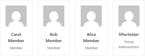
The Group Members widget displays the members of a LifterLMS Group in a responsive card grid. Each card shows the member's avatar, name, and role (Member, Leader, or Group Administrator). It's most often used on a group page template to give members a sense of who else is in their cohort.
The widget can pull from the current group (when used in a Theme Builder template for the llms_group post type) or from a specific group chosen at design time.
This widget is available when the LifterLMS Groups add-on is installed and activated alongside Lifter Elements. Without LifterLMS Groups, the widget is not registered.
Getting to know the widget
In the Elementor widget panel, look for the Group Members tile under the Lifter Elements - Groups category:

Dropped into a page or template, the widget renders a grid of member cards showing each member's avatar, name, and role:
Content Tab

Content Section
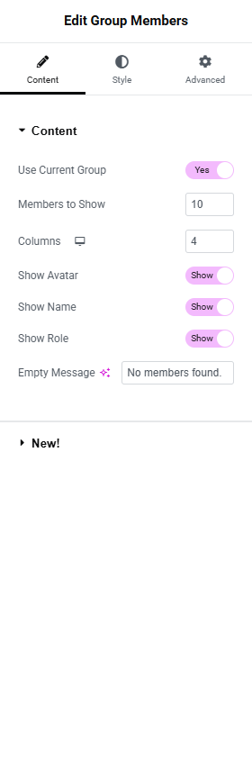
Use Current Group
- Toggle Switch:
- Yes (default): Resolves the group ID from the current post being rendered. Use this on a Theme Builder template for the
llms_grouppost type. - No: Reveals the Group dropdown below so you can pick a specific group.
- Yes (default): Resolves the group ID from the current post being rendered. Use this on a Theme Builder template for the
Group
Only shown when Use Current Group is No.
- Dropdown (SELECT2): Lists every published group. Pick the group whose members you want to display.
Members to Show
- Number field: How many members to render. Default
10, range1to100.
This widget caps at 100 members per render — there is currently no pagination control. Larger groups will show the first N members only.
Columns
The number of cards per row, with separate values for each viewport.
- Device icon: For selecting which viewpoint you're editing the settings for. More details can be found here.
- Desktop: Default
4 - Tablet Portrait: Default
2 - Mobile Portrait: Default
1
- Desktop: Default
- Number field: Range
1to6
Show Avatar
- Toggle Switch: Default On. Shows the member's WordPress avatar.
Show Name
- Toggle Switch: Default On. Shows the member's display name.
Show Role
- Toggle Switch: Default On. Shows the member's role in this group: Member, Leader, or Group Administrator.
Empty Message
- Input Field: The message rendered when the group has no members. Default No members found.
Style Tab
Card Section
Background Color
Border (Group Control)
Border Radius
Box Shadow (Group Control)
Padding
Gap Between Cards
- Unit Selector: px
- Slider: Range
0to60. Default20. Sets the gap on the CSS grid container.legi-group-members-grid.
Avatar Section
Only available when Show Avatar is On.
Size
- Unit Selector: px
- Slider: Range
20to200
Object Fit
- Dropdown Selector: Default / Contain / Cover / Fill
Border Radius
Useful for circular avatars — set all sides to 50%.
Alignment
- Left, Center, Right
Name Section
Only available when Show Name is On.
Typography
Color
The Show Role display does not have its own dedicated Style section in the current widget — role text inherits styling from the parent container. Custom styling can be applied via the Advanced tab's Custom CSS, targeting .legi-member-role.
Advanced Tab

The Advanced tab provides additional settings and customization options for fine-tuning appearance, custom CSS, responsiveness, and advanced features. More details here.
Layout section
Margin / Padding / Width / Align Self / Order / Size / Position / Z-Index / CSS ID / CSS Classes / Display Conditions
Standard Elementor layout controls. More details on each at the Elementor Advanced tab help page.
Motion Effects section
This Elementor feature is only available in their Elementor Pro version.
Includes Scrolling Effects, Mouse Effects, Sticky behaviour, and Entrance Animation. See Elementor's Motion Effects help.
Transform / Background / Border / Mask sections
Standard Elementor controls for visual transformation, background styling, border styling, and SVG masking. See the Elementor Advanced tab help for details.
Conditional Logic section
Lifter Elements allows you to dynamically show or hide widgets, sections and columns in Elementor — including based on whether the current user is enrolled in the group, has a specific role, or other group conditions. More details here.
This Lifter Elements feature is only available if Elementor Pro is installed & activated.
Responsive section
- Hide On Desktop / Tablet Portrait / Mobile Portrait
Attributes section
Custom HTML attributes via key|value syntax.
This Elementor feature is only available in their Elementor Pro version.
Custom CSS section
Custom CSS scoped to this widget only.