Widgets - Group Invitation Link
Overview
The Group Invitation Link widget renders a button that links to a LifterLMS Group's open invitation URL. Anyone who clicks the button — even users not yet enrolled — can join the group as a member.
This is the simplest way to surface a group's "Join Group" call-to-action on a public page, in a course's sidebar, or anywhere else the group's open invitation should be visible.
This widget is available when the LifterLMS Groups add-on is installed and activated alongside Lifter Elements. Without LifterLMS Groups, the widget is not registered.
The button only renders when the target group has an open invitation link enabled in its Members → Invite Members → Invite with Link settings. If no open link exists, the widget renders nothing (unless the No Invitation Message field is set — see below).
Getting to know the widget
In the Elementor widget panel, look for the Group Invitation Link tile under the Lifter Elements - Groups category:

Dropped into a page or template, the widget renders as a styled "Join Group" button:
Content Tab
Content Section
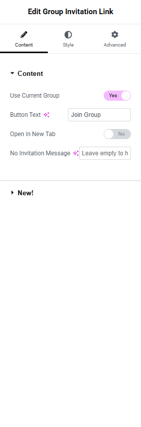
Use Current Group
- Toggle Switch:
- Yes (default): Resolves the group from the current post.
- No: Reveals the Group dropdown.
Group
Only shown when Use Current Group is No.
- Dropdown (SELECT2): Pick a specific group.
Button Text
- Input Field: The button label. Default Join Group.
Open in New Tab
- Toggle Switch: Default Off. When On, the button opens the invitation URL in a new browser tab with
rel="noopener noreferrer".
No Invitation Message
- Input Field: Optional fallback text shown when the group has no open invitation enabled.
- Default: empty (the widget renders nothing in this state).
- When set, the message renders inside a
<p>element in place of the button.
Leave the No Invitation Message empty to keep your design clean when no invite is available. Set it (e.g. "Invitations are temporarily closed.") when you want users to know the link is intentionally unavailable.
Style Tab
Button Section
Standard button styling split between Normal and Hover states.
Typography
Text Color / Background Color (per state)
Border (Group Control)
Border Radius
Padding
Advanced Tab

The Advanced tab provides standard Elementor layout, motion effects, transform, background, border, mask, conditional logic, responsive, attributes, and custom CSS controls. See the Elementor Advanced tab help page for details.
The Motion Effects, Sticky, Attributes, and Mask sections require Elementor Pro.
Conditional Logic section
Lifter Elements allows you to dynamically show or hide this widget based on group state, user role, enrollment, and more. More details here.
This Lifter Elements feature is only available if Elementor Pro is installed & activated.