Widgets - Group Page Course Card
Overview
The Group Page Course Card widget displays the course or membership that a LifterLMS Group is linked to, as a styled card. It includes the thumbnail, title, excerpt, and (for courses) difficulty and lesson count.
This widget is designed for use on group page templates built in Elementor's Theme Builder. It auto-detects whether the linked post is a course or a membership and only shows course-specific meta (difficulty, lesson count) when the linked post is a course.
This widget is available when the LifterLMS Groups add-on is installed and activated alongside Lifter Elements. Without LifterLMS Groups, the widget is not registered.
Getting to know the widget
In the Elementor widget panel, look for the Group Page Course Card tile under the Lifter Elements - Groups category:

Dropped into a page or template, the widget renders as a styled card with the linked course's thumbnail, title, excerpt, difficulty, and lesson count:

Content Tab

Content Section
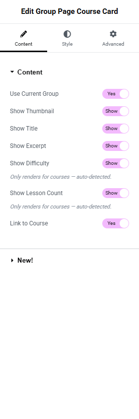
Use Current Group
- Toggle Switch:
- Yes (default): Resolves the group from the current post being rendered. Use this on a Theme Builder template for the
llms_grouppost type. - No: Reveals the Group dropdown.
- Yes (default): Resolves the group from the current post being rendered. Use this on a Theme Builder template for the
Group
Only shown when Use Current Group is No.
- Dropdown (SELECT2): Pick a specific group.
Show Thumbnail
- Toggle Switch: Default On. Shows the course/membership featured image at the top of the card.
Show Title
- Toggle Switch: Default On. Shows the course/membership title.
Show Excerpt
- Toggle Switch: Default On. Shows the course/membership excerpt.
Show Difficulty
- Toggle Switch: Default On. Displays the course difficulty term.
- Description: "Only renders for courses — auto-detected."
Difficulty is a course-only field — if the group is linked to a membership, this toggle is silently ignored at render time, even if it's set to On.
Show Lesson Count
- Toggle Switch: Default On. Displays "Lessons: N" where N is the course's lesson count.
- Description: "Only renders for courses — auto-detected."
Same as Difficulty — Lesson Count only renders when the linked post is a course. Memberships do not have lessons.
Link to Course
- Toggle Switch: Default On. When On, the thumbnail and title become links to the course/membership page. When Off, they render as static elements.
Style Tab
Card Section
Background Color
Border (Group Control)
Border Radius
Box Shadow (Group Control)
Padding
Standard card styling controls.
Thumbnail Section
Only available when Show Thumbnail is On.
Height
- Unit Selector: px
- Slider: Range
50to600
Object Fit
- Dropdown Selector: Default / Contain / Cover / Fill
Alignment
- Left, Center, Right
Title Section
Only available when Show Title is On.
Typography
Color
Hover Color (only applies when Link to Course is On)
Excerpt Section
Only available when Show Excerpt is On.
Typography
Color
Meta Section
Only available when Show Difficulty or Show Lesson Count is On.
Styles the label/value pairs for difficulty and lesson count.
Label Typography / Label Color
Value Typography / Value Color
Advanced Tab

The Advanced tab provides standard Elementor layout, motion effects, transform, background, border, mask, conditional logic, responsive, attributes, and custom CSS controls. See the Elementor Advanced tab help page for details.
The Motion Effects, Sticky, Attributes, and Mask sections require Elementor Pro.
Conditional Logic section
Lifter Elements allows you to dynamically show or hide widgets, sections and columns based on group state, user role, enrollment, and more. More details here.
This Lifter Elements feature is only available if Elementor Pro is installed & activated.