Worked example — Group landing page template
What we're building
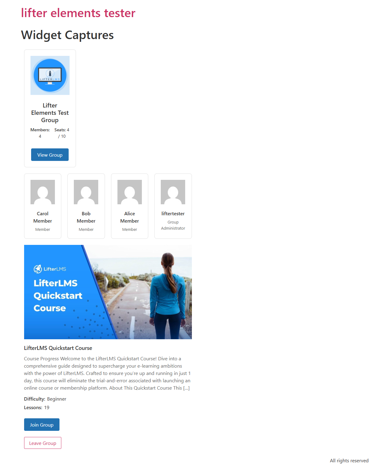
A reusable group page template in Elementor's Theme Builder that automatically renders for every group on your site. The template uses all five Lifter Elements Groups widgets plus a couple of Groups dynamic tags, so each group shows its own banner, logo, name, course card, member grid, invite link, and leave button — without you editing individual group posts.
By the end, visiting any group's URL will render this layout, populated with that group's data.
- Lifter Elements 1.7.0+ with LifterLMS Groups installed and activated
- Elementor Pro (required for Theme Builder)
- At least one group already created with a banner, logo, members, and a linked course (see the Using LifterLMS Groups guide → Prerequisites section)
Step 1 — Create the Theme Builder template
- From the WordPress admin, go to Templates → Theme Builder
- Click Add New at the top of the screen
- For Template Type, choose Single Post
- Give the template a name (e.g. Group Page Template) and click Create Template
When the Elementor editor opens, it'll prompt you to insert a template from the library. Skip that — we're building from scratch.
Step 2 — Build a hero section with banner + logo + name
The hero anchors the page visually and shows which group the visitor is on.
- Drag a new Section onto the canvas with a single-column structure
- On the section settings, open the Style tab → Background → Background Type: Classic
- Click the Background Image dynamic-tag icon and choose Group Banner from the LifterElements: Groups group. The section now pulls its background from the current group's banner image.
- Set Min Height to about 320px so the hero has presence
Inside the section's column:
- Drop an Image widget. On its Content tab, click the dynamic-tag icon next to Image and select Group Logo. Constrain the width to ~120px so it sits as a circular badge.
- Drop a Heading widget below it. Click the dynamic-tag icon next to Title and select Group Name. Bump the heading size to XXL and set text color to white for contrast against the banner.
The hero is now a self-styling component — every group page will render its own banner, logo, and name.
Add a sub-heading using the Group Visibility dynamic tag to surface whether the group is Open, Private, or Closed. Useful context for visitors who land on a group page directly.
Step 3 — Add the course card
Show the course or membership the group is built around.
- Drop a new Section below the hero, single column
- Inside it, drop the Group Page Course Card widget
- Leave Use Current Group = Yes (the default) — the widget will resolve to whichever group post is being rendered
The widget auto-detects whether the linked content is a course or a membership and shows the relevant meta (difficulty, lesson count for courses; nothing extra for memberships).
Step 4 — Add the members grid
Show who's in the group.
- Drop another Section below the course card
- Drop the Group Members widget into it
- Leave Use Current Group = Yes
- On the Content tab: set Members to Show to a sensible cap (e.g. 12) so the grid doesn't sprawl on large groups
- On the Style tab: tweak avatar size, card spacing, and column count to match your site's design
Step 5 — Add action buttons (invite + leave)
These give visitors something to do on the page.
- Drop a new Section with a two-column structure
- In the left column, drop the Group Invitation Link widget. Set the button text to Join this Group.
- In the right column, drop the Leave Group widget. Style its button with a warning color (red/orange) so it's clearly distinct from the primary CTA.
These widgets are designed to be safely visible to anyone:
- The invite button only renders when the group has an open invitation link enabled
- The leave button only renders for users whose role in the group is
member(admins and leaders won't see it)
You can hide the entire CTA section from non-members using the User Group Enrollment conditional-logic condition. Open the section's Advanced tab → Conditional Logic, click Open Conditional Logic Settings, and add a rule: User Group Enrollment is Enrolled in current group. Now the section only shows to people already in the group — non-members see a cleaner public view.
Step 6 — Set display conditions
Tell Elementor when to use this template.
- Click the publish settings arrow (next to the green Publish button at the bottom of the panel)
- In Conditions, click Add Condition
- Set Include → Singular → Groups (the
llms_grouppost type) - For all groups, leave the third dropdown at "All Groups"; for a specific group, pick that group from the list
- Click Save & Close then Publish
The template is now live for every group post matching the condition.
Step 7 — Verify
- Open your site's frontend (logged-out is fine for a public group, or as a member for a private one)
- Visit any group's URL — typically
/group/<slug>/ - Confirm the page renders the banner, logo, name, course card, members, and action buttons populated from that specific group's data
If the page renders without the group's data (showing only default placeholder content), see the Troubleshooting section of the main guide — usually it's because the template's display condition isn't set, or LifterLMS Groups isn't active.
What to try next
- Personalize with role: drop a Heading widget bound to the Current User Group Role dynamic tag for a "Welcome, Leader" / "Welcome, Member" greeting. Logged-out visitors and non-members get nothing (the tag returns empty).
- Add a leader-only sidebar: see the Leader-only sidebar worked example — uses the User Group Role conditional-logic condition to show a section only to group leaders.
- Show a "Group is full" message: add an empty section with a heading "This group is full — invitations are closed" and gate it with Group Seat Availability is Current group has no open seats. Pair with the invite link section gated the opposite way (has open seats) so visitors see exactly one of the two.