Widgets - Course List
Course List Widget - Overview
The Courses List widget in Lifter Elements allows you to display a list of courses on any page of your site. You can use this widget to create a dynamic course catalog, with options to filter and sort courses as needed. This gives you control over how your courses are displayed, ensuring that prospective students see the right content in a visually appealing way.
Getting to know the widget

Content Tab

Render Section
The Render section designates how the widget displays on the frontend. You can think of it as selecting a "theme" for the widget.
Render
- Dropdown Selector: Where you select the desired option.
- LifterLMS render: This setting makes the Course List widget adopt the default styling provided by the LifterLMS plugin. This ensures that the button design matches the standard appearance of other LifterLMS elements, providing a consistent user experience without needing custom styling adjustments.
- LifterElements' render: This setting allows you to style the Course List widget directly through Elementor. This gives you full control over the button's design, including colors, typography, and other visual aspects, enabling you to create a look that matches your site's unique style.
Columns
Set how many columns of your courses' cards you'd like this widget to display.
- Device icon: For selecting which viewpoint you're editing the settings for. More details can be found here.
- Dropdown Selector: Used to select the number of columns you want the table to display. Choose between 1 and 6.
Equal Heights?
This forces all of your columns to be equal height
- Toggle Switch:
- On:
- Off:
Min Height
You can set all of your columns to be a specific minimum height
- Device icon: For selecting which viewpoint you're editing the settings for. More details can be found here.
- Unit Selector: For selecting which units of measure are being used for the values entered
- Slider:
- Input field:
Content Section
The options in this section assign filters to this widget. Each additional selection filters adds its filter on top of your other selections. For example, if you select in Course Category option "One", and then select in Course Tag option "A", then this widget will only display courses that have the category "One" AND the tag "A".
Course Category
- Dropdown Selector: Where you select the desired option. The available options will be the Course Categories your site has available. You can check at Courses > Categories.
Course Tag
- Dropdown Selector: Where you select the desired option. The available options will be the Course Tags your site has available. You can check at Courses > Tags.
Course Track
- Dropdown Selector: Where you select the desired option. The available options will be the Course Tracks your site has available. You can check at Courses > Tracks.
Course Difficulty
- Dropdown Selector: Where you select the desired option. The available options will be the Course Difficulties your site has available. You can check at Courses > Difficulties.
Show hidden courses
- Toggle Switch:
- Show:
- Hide:
Filters:
- Dropdown Selector:
- None (Show all courses):
- Show all enrolled courses (including expired & cancelled):
- Show only available enrolled courses:
- Show only available unenrolled courses:
- Show expired enrolled courses:
- Show cancelled enrolled courses:
Order
- Dropdown Selector:
- Ascending order:
- Descending order:
Order by
- Dropdown Selector:
- Author:
- Course Completion:
- Date:
- ID:
- Last modification:
- Menu order:
- Name:
- Random:
- Title:
Posts per page
Set the number of courses you would like on the page/template
- Input field:
Custom template Section
This allows you to change the order of information within the course card. You're able to drag and drop the order any way that you like and have full control over how the course widget is displayed.
This section is only available if the LifterElements' render option is selected at the Content tab** > Render section > Render option.
Template items
This section allows you to control what parts you want to include, and options to customize those parts according to your design needs.
You can have as many (or few) items to display as you'd like! The items can also be dragged-and-dropped to display in the order you require.
Element type: Course Title
-
CSS classes: Allows you to assign custom CSS classes to this element or widget. This feature is useful for adding additional styling through custom CSS code. More details here.
- Input field: Assigns custom CSS classes to the widget. You can add multiple classes (separated by spaces), enabling advanced styling through custom CSS rules. Note: The dot/period for CSS selectors shouldn't be added here.
-
Title link to the course:
- Enable:
- Disable:
-
HTML Tag: Select what HTML tag you want to wrap the title with.
- Dropdown Selector:
- H1:
- H2:
- H3:
- H4:
- H5:
- H6:
- div:
- span:
- p:
- Dropdown Selector:
Element type: Course Excerpt
-
CSS classes: Allows you to assign custom CSS classes to this element or widget. This feature is useful for adding additional styling through custom CSS code. More details here.
- Input field: Assigns custom CSS classes to the widget. You can add multiple classes (separated by spaces), enabling advanced styling through custom CSS rules. Note: The dot/period for CSS selectors shouldn't be added here.
-
Max. characters number:
- Input field:
-
Content when text is trimmed:
- Input field:
Element type: Course Link
-
CSS classes: Allows you to assign custom CSS classes to this element or widget. This feature is useful for adding additional styling through custom CSS code. More details here.
- Input field: Assigns custom CSS classes to the widget. You can add multiple classes (separated by spaces), enabling advanced styling through custom CSS rules. Note: The dot/period for CSS selectors shouldn't be added here.
-
Target:
- Dropdown Selector:
- Course Page:
- Continue course:
- Dropdown Selector:
-
Use custom text
- Toggle Switch:
- Yes:
- No:
- Toggle Switch:
-
Alignment
- Device icon: For selecting which viewpoint you're editing the settings for. More details can be found here.
- Desktop:
- Tablet Portrait:
- Mobile Portrait:
- Left: Sets your button to display from the left side of its container
- Center: Sets your button to display at the center of its container
- Right: Sets your button to display from the right side of its container
- Device icon: For selecting which viewpoint you're editing the settings for. More details can be found here.
-
HTML Tag:
- Dropdown Selector:
- Text:
- Button:
- Dropdown Selector:
-
Icon: Here you can select and style an icon to be displayed wiith the course link.
-
Icon Position:
- Dropdown Selector:
- Before:
- After:
- Dropdown Selector:
-
Icon Spacing:
- Slider:
- Input field:
-
Normal or Hover: This toggle controls which state you're editing the settings for. Normal is for the button in its normal state, while Hover is for when the button is being hovered over by the mouse cursor.

- Icon Color:
- Global Colors Selector: Use this to select one of your site's pre-configured Global styling options.
- Color Picker: Use this to select a specific color.
- Icon Color:
Element type: Course Price
-
CSS classes: Allows you to assign custom CSS classes to this element or widget. This feature is useful for adding additional styling through custom CSS code. More details here.
- Input field: Assigns custom CSS classes to the widget. You can add multiple classes (separated by spaces), enabling advanced styling through custom CSS rules. Note: The dot/period for CSS selectors shouldn't be added here.
-
Plan:
- Dropdown Selector:
- First featured plan:
- First plan:
- Dropdown Selector:
-
Output style:
- Dropdown Selector:
- Price and frequency:
- Price:
- Frequency:
- Dropdown Selector:
-
Show old price?
- Toggle Switch:
- Show:
- Hide:
- Toggle Switch:
Element type: Course Progress
-
CSS classes: Allows you to assign custom CSS classes to this element or widget. This feature is useful for adding additional styling through custom CSS code. More details here.
- Input field: Assigns custom CSS classes to the widget. You can add multiple classes (separated by spaces), enabling advanced styling through custom CSS rules. Note: The dot/period for CSS selectors shouldn't be added here.
-
Height:
- Device icon: For selecting which viewpoint you're editing the settings for. More details can be found here.
- Unit Selector: For selecting which units of measure are being used for the values entered
- Slider:
- Input field:
-
Show progress number?:
- Dropdown Selector:
- No:
- Percentage:
- Steps:
- Dropdown Selector:
-
Show progress for non enrolled user:
- Toggle Switch:
- Show:
- Hide:
- Toggle Switch:
Element type: Custom Text
-
CSS classes: Allows you to assign custom CSS classes to this element or widget. This feature is useful for adding additional styling through custom CSS code. More details here.
- Input field: Assigns custom CSS classes to the widget. You can add multiple classes (separated by spaces), enabling advanced styling through custom CSS rules. Note: The dot/period for CSS selectors shouldn't be added here.
-
Custom text:
- Input field: Where you add your custom text.
- Dynamic Tags: You can use the Dynamic Tags button to select and add some Dynamic Tags for use in the field. More details here
Element type: Image
-
CSS classes: Allows you to assign custom CSS classes to this element or widget. This feature is useful for adding additional styling through custom CSS code. More details here.
- Input field: Assigns custom CSS classes to the widget. You can add multiple classes (separated by spaces), enabling advanced styling through custom CSS rules. Note: The dot/period for CSS selectors shouldn't be added here.
-
Image type
- Dropdown Selector:
- Course featured image:
- Custom image:
- Dropdown Selector:
-
Add link?
- Toggle Switch:
- Yes:
- No:
- Toggle Switch:
-
Fallback image if no content?
- Toggle Switch:
- Show:
- Hide:
- Toggle Switch:
Element type: Taxonomy
-
CSS classes: Allows you to assign custom CSS classes to this element or widget. This feature is useful for adding additional styling through custom CSS code. More details here.
- Input field: Assigns custom CSS classes to the widget. You can add multiple classes (separated by spaces), enabling advanced styling through custom CSS rules. Note: The dot/period for CSS selectors shouldn't be added here.
-
Taxonomy:
- Dropdown Selector:
- Course Categories:
- Course Difficulties:
- Course Tags:
- Course Tracks:
- Tags:
- Dropdown Selector:
Element type: Video
-
CSS classes: Allows you to assign custom CSS classes to this element or widget. This feature is useful for adding additional styling through custom CSS code. More details here.
- Input field: Assigns custom CSS classes to the widget. You can add multiple classes (separated by spaces), enabling advanced styling through custom CSS rules. Note: The dot/period for CSS selectors shouldn't be added here.
-
Fallback image if no content?
- Toggle Switch:
- Show:
- Hide:
- Toggle Switch:
Element type: Video or Featured Image
-
CSS classes: Allows you to assign custom CSS classes to this element or widget. This feature is useful for adding additional styling through custom CSS code. More details here.
- Input field: Assigns custom CSS classes to the widget. You can add multiple classes (separated by spaces), enabling advanced styling through custom CSS rules. Note: The dot/period for CSS selectors shouldn't be added here.
-
Add link?
- Toggle Switch:
- Yes:
- No:
- Toggle Switch:
-
Fallback image if no content?
- Toggle Switch:
- Show:
- Hide:
- Toggle Switch:
New! Section
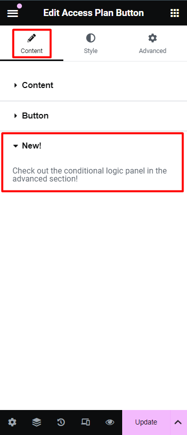
In this section we mention any new features or functions that have recently been added.
Style Tab
Items Section
Background Color Option
Uses a solid color as the background. You can choose a color for the background from the color picker.
- Global Colors Selector: Use this to select one of your site's pre-configured Global styling options.
- Color Picker: Use this to select a specific color.
Border Type Option
From the dropdown menu select between solid, double, dotted, dashed, or grooved
- Default: Follows your theme's styling for borders/
- None:
- Solid: A Solid Single line around the element
- Double: A Solid Double line around the element
- Dotted: A Single Dotted line around the element
- Dashed: A Single Dashed line around the element
- Groove: A Grooved border which appears like a picture frame
Border Radius Option
Rounds the corners of the widget. You can set a value for the border radius to create rounded corners. Higher values result in more rounded corners.
- Unit Selector: For selecting which units of measure are being used for the values entered
- Top:
- Right:
- Bottom:
- Left:
- Link values together: When this option is enabled, it will force all sides (top, right, bottom, left) to have the same value.
Box Shadow Option
Shadow allows you to add a visual effect to an element giving it more depth and creating a 3D effect.You can modify these shadows by changing their color, size, angle and position. More details here.
Padding Option
Set the Padding of the selected element in PX, EM, REM, or %. Similar to margin, you can set values for top, right, bottom, and left padding. Padding affects the space between the content and the element’s border. More details here.

- Device icon: For selecting which viewpoint you're editing the settings for. More details can be found here.
- Unit Selector: For selecting which units of measure are being used for the values entered
- Top:
- Right:
- Bottom:
- Left:
- Link values together: When this option is enabled, it will force all sides (top, right, bottom, left) to have the same value.
Typography Section
This section is only available if the LifterElements' render option is selected at the Content tab** > Render section > Render option.
Title Color
- Global Colors Selector: Use this to select one of your site's pre-configured Global styling options.
- Color Picker: Use this to select a specific color.
Title Typography
Customize text appearance, including font type, size, weight, spacing, and line height. These settings help you achieve a consistent style and improve readability across your site. More details can be found here.
- Global Fonts Selector: Use this to select one of your site's pre-configured Global styling options.
- Edit Icon: Clicking this will open the menu of available Typography settings.
Title Text Shadow
Shadow allows you to add a visual effect to an element giving it more depth and creating a 3D effect.You can modify these shadows by changing their color, size, angle and position. More details here.
Title Alignment
This section controls the text alignment of the course card's title text.
- Left: Sets the title text to display starting from the left side of its container
- Center: Sets the title text to display at the center of its container
- Right: Sets the title text to display starting from from the right side of its container
Title Padding
Set the Padding of the course card's title text in PX, EM, REM, or %. Similar to margin, you can set values for top, right, bottom, and left padding. Padding affects the space between the content and the element’s border. More details here.
- Device icon: For selecting which viewpoint you're editing the settings for. More details can be found here.
- Unit Selector: For selecting which units of measure are being used for the values entered
- Top:
- Right:
- Bottom:
- Left:
- Link values together: When this option is enabled, it will force all sides (top, right, bottom, left) to have the same value.
Price Color
- Global Colors Selector: Use this to select one of your site's pre-configured Global styling options.
- Color Picker: Use this to select a specific color.
Price Typography
Customize text appearance, including font type, size, weight, spacing, and line height. These settings help you achieve a consistent style and improve readability across your site. More details can be found here.
- Global Fonts Selector: Use this to select one of your site's pre-configured Global styling options.
- Edit Icon: Clicking this will open the menu of available Typography settings.
Price Text Shadow
Shadow allows you to add a visual effect to an element giving it more depth and creating a 3D effect.You can modify these shadows by changing their color, size, angle and position. More details here.
Price Alignment
This section controls the text alignment of the course card's price text.
- Left: Sets the price text to display starting from the left side of its container
- Center: Sets the price text to display at the center of its container
- Right: Sets the price text to display starting from from the right side of its container
Price Padding
Set the Padding of the course card's price text in PX, EM, REM, or %. Similar to margin, you can set values for top, right, bottom, and left padding. Padding affects the space between the content and the element’s border. More details here.
- Device icon: For selecting which viewpoint you're editing the settings for. More details can be found here.
- Unit Selector: For selecting which units of measure are being used for the values entered
- Top:
- Right:
- Bottom:
- Left:
- Link values together: When this option is enabled, it will force all sides (top, right, bottom, left) to have the same value.
Link Color
- Global Colors Selector: Use this to select one of your site's pre-configured Global styling options.
- Color Picker: Use this to select a specific color.
Link Typography
Customize text appearance, including font type, size, weight, spacing, and line height. These settings help you achieve a consistent style and improve readability across your site. More details can be found here.
- Global Fonts Selector: Use this to select one of your site's pre-configured Global styling options.
- Edit Icon: Clicking this will open the menu of available Typography settings.
Link Text Shadow
Shadow allows you to add a visual effect to an element giving it more depth and creating a 3D effect.You can modify these shadows by changing their color, size, angle and position. More details here.
Link Alignment
This section controls the text alignment of the course card's link text.
- Left: Sets the link text to display starting from the left side of its container
- Center: Sets the link text to display at the center of its container
- Right: Sets the link text to display starting from from the right side of its container
Link Padding
Set the Padding of the course card's link text in PX, EM, REM, or %. Similar to margin, you can set values for top, right, bottom, and left padding. Padding affects the space between the content and the element’s border. More details here.
- Device icon: For selecting which viewpoint you're editing the settings for. More details can be found here.
- Unit Selector: For selecting which units of measure are being used for the values entered
- Top:
- Right:
- Bottom:
- Left:
- Link values together: When this option is enabled, it will force all sides (top, right, bottom, left) to have the same value.
Custom Color
- Global Colors Selector: Use this to select one of your site's pre-configured Global styling options.
- Color Picker: Use this to select a specific color.
Custom Typography
Customize text appearance, including font type, size, weight, spacing, and line height. These settings help you achieve a consistent style and improve readability across your site. More details can be found here.
- Global Fonts Selector: Use this to select one of your site's pre-configured Global styling options.
- Edit Icon: Clicking this will open the menu of available Typography settings.
Custom Text Shadow
Shadow allows you to add a visual effect to an element giving it more depth and creating a 3D effect.You can modify these shadows by changing their color, size, angle and position. More details here.
Custom Alignment
This section controls the text alignment of the course card's custom text.
- Left: Sets the custom text to display starting from the left side of its container
- Center: Sets the custom text to display at the center of its container
- Right: Sets the custom text to display starting from from the right side of its container
Custom Padding
Set the Padding of the course card's title text in PX, EM, REM, or %. Similar to margin, you can set values for top, right, bottom, and left padding. Padding affects the space between the content and the element’s border. More details here.
- Device icon: For selecting which viewpoint you're editing the settings for. More details can be found here.
- Unit Selector: For selecting which units of measure are being used for the values entered
- Top:
- Right:
- Bottom:
- Left:
- Link values together: When this option is enabled, it will force all sides (top, right, bottom, left) to have the same value.
Progress Bar Section
This section is only available if the LifterElements' render option is selected at the Content tab** > Render section > Render option.
Bar Color
- Global Fonts Selector: Use this to select one of your site's pre-configured Global styling options.
- Edit Icon: Clicking this will open the menu of available Typography settings.
Bar Background Color
- Global Fonts Selector: Use this to select one of your site's pre-configured Global styling options.
- Edit Icon: Clicking this will open the menu of available Typography settings.
Border Type Option
From the dropdown menu select between solid, double, dotted, dashed, or grooved
- Default: Follows your theme's styling for borders/
- None:
- Solid: A Solid Single line around the element
- Double: A Solid Double line around the element
- Dotted: A Single Dotted line around the element
- Dashed: A Single Dashed line around the element
- Groove: A Grooved border which appears like a picture frame
Border Radius Option
Rounds the corners of the widget. You can set a value for the border radius to create rounded corners. Higher values result in more rounded corners.
- Unit Selector: For selecting which units of measure are being used for the values entered
- Top:
- Right:
- Bottom:
- Left:
- Link values together: When this option is enabled, it will force all sides (top, right, bottom, left) to have the same value.
Padding
Set the Padding of the progress bar in PX, EM, REM, or %. Similar to margin, you can set values for top, right, bottom, and left padding. Padding affects the space between the content and the element’s border. More details here.
- Device icon: For selecting which viewpoint you're editing the settings for. More details can be found here.
- Unit Selector: For selecting which units of measure are being used for the values entered
- Top:
- Right:
- Bottom:
- Left:
- Link values together: When this option is enabled, it will force all sides (top, right, bottom, left) to have the same value.
Button Section
The settings here control the styling and layout of the button template part for all the course cards.
This section is only available if the LifterElements' render option is selected at the Content tab** > Render section > Render option.
Normal or Hover State Styling
This toggle controls which state you're editing the settings for. Normal is for the button in its normal state, while Hover is for when the button is being hovered over by the mouse cursor.
Text Color

- Global Colors Selector: Use this to select one of your site's pre-configured Global styling options.
- Color Picker: Use this to select a specific color.
Background Color Option
Uses a solid color as the background. You can choose a color for the background from the color picker.
- Global Colors Selector: Use this to select one of your site's pre-configured Global styling options.
- Color Picker: Use this to select a specific color.
Border Color
Select or edit the button's border color.
- Global Colors Selector: Use this to select one of your site's pre-configured Global styling options.
- Color Picker: Use this to select a specific color.
Border Type Option
From the dropdown menu select between solid, double, dotted, dashed, or grooved
- Default: Follows your theme's styling for borders/
- None:
- Solid: A Solid Single line around the element
- Double: A Solid Double line around the element
- Dotted: A Single Dotted line around the element
- Dashed: A Single Dashed line around the element
- Groove: A Grooved border which appears like a picture frame
Border Radius Option
Rounds the corners of the widget. You can set a value for the border radius to create rounded corners. Higher values result in more rounded corners.
- Unit Selector: For selecting which units of measure are being used for the values entered
- Top:
- Right:
- Bottom:
- Left:
- Link values together: When this option is enabled, it will force all sides (top, right, bottom, left) to have the same value.
Box Shadow Option
Shadow allows you to add a visual effect to an element giving it more depth and creating a 3D effect.You can modify these shadows by changing their color, size, angle and position. More details here.
Padding Option
Set the Padding of the selected element in PX, EM, REM, or %. Similar to margin, you can set values for top, right, bottom, and left padding. Padding affects the space between the content and the element’s border. More details here.
- Device icon: For selecting which viewpoint you're editing the settings for. More details can be found here.
- Unit Selector: For selecting which units of measure are being used for the values entered
- Top:
- Right:
- Bottom:
- Left:
- Link values together: When this option is enabled, it will force all sides (top, right, bottom, left) to have the same value.
Advanced Tab

The Advanced tab provides additional settings and customization options. It’s a tab where you can fine-tune the appearance, add custom CSS, control responsiveness, and configure advanced features specific to the selected widget or container.
The options in the Advanced tab are designed for users who want greater control over the design and functionality of their widgets and containers. More details can be found here
Layout section
Margin
Set the Margin of the selected element in PX, EM, REM, or %. You can set values for top, right, bottom, and left margins. Positive values increase space, while negative values decrease space. More details here.

- Device icon: For selecting which viewpoint you're editing the settings for. More details can be found here.
- Unit Selector: For selecting which units of measure are being used for the values entered
- Top:
- Right:
- Bottom:
- Left:
- Link values together: When this option is enabled, it will force all sides (top, right, bottom, left) to have the same value.
Padding
Set the Padding of the selected element in PX, EM, REM, or %. Similar to margin, you can set values for top, right, bottom, and left padding. Padding affects the space between the content and the element’s border. More details here.
- Device icon: For selecting which viewpoint you're editing the settings for. More details can be found here.
- Unit Selector: For selecting which units of measure are being used for the values entered
- Top:
- Right:
- Bottom:
- Left:
- Link values together: When this option is enabled, it will force all sides (top, right, bottom, left) to have the same value.
Width
Select the width of the widget.

- Device icon: For selecting which viewpoint you're editing the settings for. More details can be found here.
- Dropdown selector: For selecting which width setting you want.
- Default: Width is automatically determined by the content.
- Full Width (100%): Spans the full width of the container.
- Inline (auto): Inline elements automatically adjust their width based on content.
- Custom: Allows you to set a specific width value.
Align Self
Aligns the element within its container.

- Device icon: For selecting which viewpoint you're editing the settings for. More details can be found here.
- Start:
- Center:
- End:
- Stretch:
Order
Specifies the order of the widget within a flex container. Allows you to change the order of the widget relative to other items in a flex container. Lower values appear first.

- Device icon: For selecting which viewpoint you're editing the settings for. More details can be found here.
- Start:
- End:
- Custom:
- Custom Order:
- Device icon: For selecting which viewpoint you're editing the settings for. More details can be found here.
- Custom Order:
Size
The flex grow/shrink property specifies how the item will behave relative to the rest of the flexible items inside the same container.

- Device icon: For selecting which viewpoint you're editing the settings for. More details can be found here.
- None:
- Grow:
- Shrink:
- Custom:
Position
This option allows you to select absolute or fixed positioning for your element.

- Default: The element is in its natural state, positioned merely by the natural flow of the page. This is the default position of all elements.
- Absolute: The element is positioned based on its first parent element that has a specified position. You can manually set the exact X and Y positions (horizontal and vertical) for precise placement.
- Fixed: The element is fixed in a custom position even when the page is scrolled. It stays in place relative to the user’s viewport (what they can see on their screen).
Z-Index
Specifies the stacking order of the widget. A higher z-index brings the widget forward in the stacking order, potentially overlapping others with lower z-index values. Learn more about Z-Index here.

- Device icon: For selecting which viewpoint you're editing the settings for. More details can be found here.
- Number field: Where you enter the value you want to specify for the widget.
CSS ID
Assigns a custom CSS ID to the widget. Allows you to target the widget with custom CSS rules.

- Input field: Assigns custom CSS ID to the widget. Note: The # for CSS selectors shouldn't be added here.
- Dynamic Tags: You can use the Dynamic Tags button to select and add some Dynamic Tags for use in the field. More details here
CSS Classes
Allows you to assign custom CSS classes to this element or widget. This feature is useful for adding additional styling through custom CSS code. More details here.

- Input field: Assigns custom CSS classes to the widget. You can add multiple classes (separated by spaces), enabling advanced styling through custom CSS rules. Note: The dot/period for CSS selectors shouldn't be added here.
- Dynamic Tags: You can use the Dynamic Tags button to select and add some Dynamic Tags for use in the field. More details here
Display Conditions
Allows you to control the visibility of your content based on various parameters. More details here.

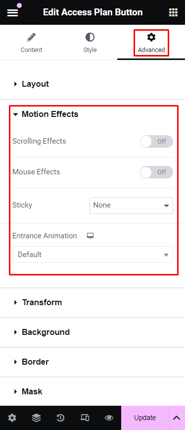
Motion Effects section
Motion Effects are a powerful set of controls for adding beautiful transitions and animations to your design. More details here.
This Elementor feature is only available in their Elementor Pro version.
Scrolling Effects
Use Scrolling Effects to create amazing animations and interactions when the user scrolls through the page. More details here.
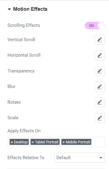
This Elementor feature is only available in their Elementor Pro version.
- Off
- On:
- Vertical Scroll: Makes the element move at a different speed than the page while scrolling, in the direction and speed of your choosing.
- Horizontal Scroll: When the visitor scrolls up and down, the element moves right and left accordingly.
- Transparency: Gradually makes elements more transparent or more visible in correlation to the visitor’s scroll.
- Blur: This setting is similar to Transparency. Here, instead of going transparent the element gets blurred.
- Rotate: The element rotates as you scroll.
- X Anchor Point and Y Anchor Point: Determine the axis around which the element scales or rotates. If you set orientation left-top, the rotation will happen around the left-top point of the element. If you set orientation center-center, the rotation will rotate around its center, like a wheel.
- Scale: The elements grow and shrink according to scroll.
- X Anchor Point and Y Anchor Point: Determine the axis around which the element scales or rotates. If you set orientation left-top, the rotation will happen around the left-top point of the element. If you set orientation center-center, the rotation will rotate around its center, like a wheel.
- Apply Effects On: Choose where you want to apply the effects on – Desktop, Tablet or Mobile.
- Effects Relative To: Determines the base for the calculation of scrolling effects and works with the Viewport scale set inside each effect.
Mouse Effects
Use Mouse Effects to create amazing animations and interactions based on the movement and position of the user's mouse on the page. More details here.

- Off
- On:
- Mouse Track: Create a sense of depth by making elements move in relation to the visitor’s mouse movement.
- 3D Tilt: Tilts the element according to the movement of the cursor.
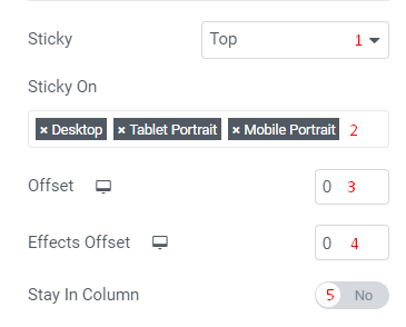
Sticky
Making a widget sticky in Elementor means that the widget will stay fixed in place as users scroll down the page. This can be particularly helpful for elements like navigation menus, call-to-action buttons, or important information that you want to keep visible as users explore content. Sticky widgets help maintain user engagement by keeping key actions or messages within easy reach, reducing the need to scroll back up, and enhancing the overall user experience. This can lead to better interaction rates and ensures that critical information or actions are always accessible. More details here
This Elementor feature is only available in their Elementor Pro version.
- Dropdown Selector: Where you select the desired option.
- Top:
- Bottom:
- Sticky On:
- Offset:
- Device icon: For selecting which viewpoint you're editing the settings for. More details can be found here.
- Number field: Where you enter the value you want to specify for the widget.
- Effects Offset:
- Device icon: For selecting which viewpoint you're editing the settings for. More details can be found here.
- Number field: Where you enter the value you want to specify for the widget.
- Stay In Column:
- Off:
- On:
Entrance Animation
The Entrance Animations feature lets you animate your Widgets, Sections, and Columns. This way, as your site visitor scrolls down the page, the elements appear with an entrance animation. More details here.

- Device icon: For selecting which viewpoint you're editing the settings for. More details can be found here.
- Dropdown Selector: Where you select the desired option.
- Fading: Fade in, fade in up, down, left, right
- Zooming: Zoom in, zoom in up, down, left, right
- Bouncing: Bounce in, bounce in up, down, left, right
- Sliding: Slide in up, down, left, right
- Rotating: Rotate in, rotate in down left, down right, up left, up right
- Attention seekers: Bounce, flash, pulse, rubber band, shake, head shake, swing, tada, wobble, jello
- Light speed: Light speed in
- Specials: Roll in
Transform section
Transform your designs with the Elementor CSS Transform Controls. Rotate, offset, scale, skew, and flip your page elements with ease. More details here.
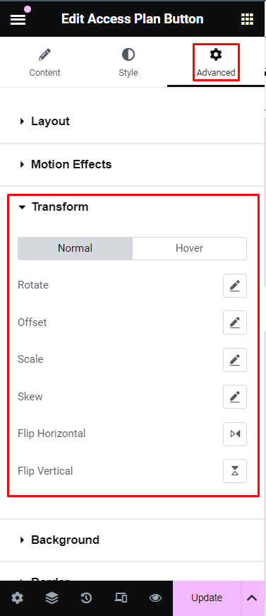
-
Normal or Hover: This toggle controls which state you're editing the settings for. Normal is for the button in its normal state, while Hover is for when the button is being hovered over by the mouse cursor.
- Rotate: You may rotate your page elements easily by using the sliders or entering the values in the field based on degrees. Toggle the 3D Rotate to be able to rotate on a specific axis and change the perspective(px). The Rotate X and Y axis is to be used in combination with perspective to achieve the desired goal.
- Offset: Offset your elements horizontally on the X axis or vertically on the Y axis. The values can be controlled by the slider or entering the values in the text fields. The values can be measured in % or PX.
- Scale: Scale elements to the perfect size in your design. The value can be controlled by the slider or entering the values in the text field based on %. You may also choose to keep the proportions intact by using the toggle control.
- Skew: Use the skew controls to give your element a leaning effect. You may set the Skew X and Y values using the slider or manually entering the field values based on %.
- Flip Horizontal: Use the Flip Horizontal icon control to reverse your element on the X axis.
- Flip Vertical: Use the Flip Vertical icon control to reverse your element on the Y axis.
Background section
The Background settings allow you to customize the background of a widget’s container. You can set a solid color, gradient, or even an image as the background, giving you more design flexibility to enhance the look and feel of each widget. This feature is useful for making specific elements stand out, creating visual separation between sections, or maintaining brand consistency by using background colors or images that align with your website’s style. More details here.
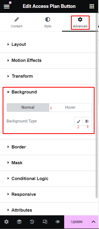
- Normal or Hover: This toggle controls which state you're editing the settings for. Normal is for the button in its normal state, while Hover is for when the button is being hovered over by the mouse cursor.
-
Background Type: The Background settings allow you to customize the background of a widget’s container. You can set a solid color, gradient, or even an image as the background, giving you more design flexibility to enhance the look and feel of each widget. This feature is useful for making specific elements stand out, creating visual separation between sections, or maintaining brand consistency by using background colors or images that align with your website’s style. More details here.
- Classic: Uses a solid color as the background. You can choose a color for the background from the color picker. The option to set an image as the background is also found here.
- Gradient: Applies a gradient as the background. You can define a gradient by selecting two or more colors and adjusting the gradient type, angle, and position.
Border section
Most elements do not have visible borders by default. Use Border Type to create a visible border around the element. These borders help the element stand out and differentiate it from other elements. More details here.
- Normal or Hover: This toggle allows you to customize the border of your widgets in both their normal state and when hovered over. The following options can be set independently for both states.
-
Border Type: From the dropdown menu select between solid, double, dotted, dashed, or grooved
- None:
- Solid: A Solid Single line around the element
- Double: A Solid Double line around the element
- Dotted: A Single Dotted line around the element
- Dashed: A Single Dashed line around the element
- Groove: A Grooved border which appears like a picture frame
-
Border Radius: Rounds the corners of the widget. You can set a value for the border radius to create rounded corners. Higher values result in more rounded corners.
- Device icon: For selecting which viewpoint you're editing the settings for. More details can be found here.
- Unit Selector: For selecting which units of measure are being used for the values entered
- Top:
- Right:
- Bottom:
- Left:
- Link values together: When this option is enabled, it will force all sides (top, right, bottom, left) to have the same value.
-
Box Shadow: Shadow allows you to add a visual effect to an element giving it more depth and creating a 3D effect.You can modify these shadows by changing their color, size, angle and position. More details here.
Mask section
The Elementor Mask Option allows you to add a mask to any element. Create stylish designs for any element you want like an image, video, Google Maps, and more using the preset shapes. Create your own masks in PNG or SVG formats and upload them for even more possibilities. More details here.

Conditional Logic section
Lifter Elements allows you to dynamically show or hide widgets, sections and columns (now called inner sections) in Elementor. This allows you to shape each student's unique experience with your course platform. More details here

This Lifter Elements feature is only available in the Lifter Elements Creator Edition and if Elementor Pro is installed & activated.
Responsive section
Responsive design controls in Elementor allow you to customize how widgets appear on different device types by hiding or showing elements based on screen size. For example, you might hide a large image on mobile to reduce loading time or show simplified content on smaller screens for easier navigation. These controls help you create a seamless and user-friendly design across all devices. More details here
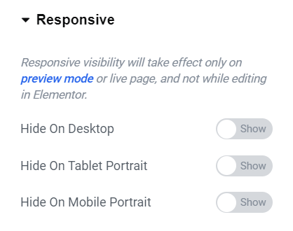
- Hide On Desktop: When enabled, this widget/element will not appear on desktop view.
- Hide On Tablet Portrait: When enabled, this widget/element will not appear on a portrait-oriented tablet's view.
- Hide On Mobile Portrait: When enabled, this widget/element will not appear on a portrait-oriented mobile's view.
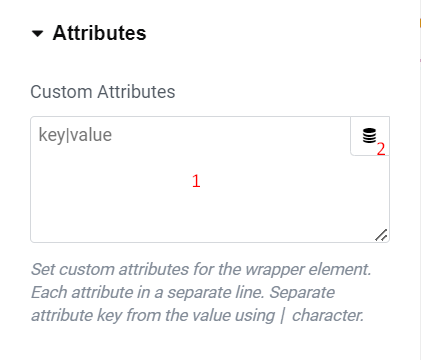
Attributes section
Enables you to add custom HTML attributes to the element. You can add attributes and values in the format “attribute=value”. For example, you might add data attributes or other custom attributes that you want to include in the HTML output of the widget. More details here.
This Elementor feature is only available in their Elementor Pro version.
- Input field: Assigns custom HTML attributes to the widget, using the format
key|value. For example, to addrole=”presentation”to the element’s HTML, enterrole|presentationhere. You can add multiple attributes with eachkey|valuepair on its own line.
Note: If you need to add multiple properties for one attribute, use a space between them.
- Dynamic Tags: You can use the Dynamic Tags button to select and add some Dynamic Tags for use in the field. More details here
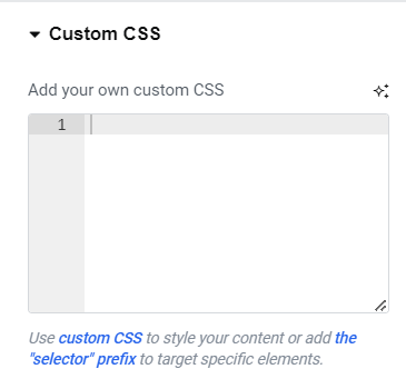
Custom CSS section
Here you can add custom CSS that is intended for this widget only. More details about this can be found at: