5.3 Style Settings
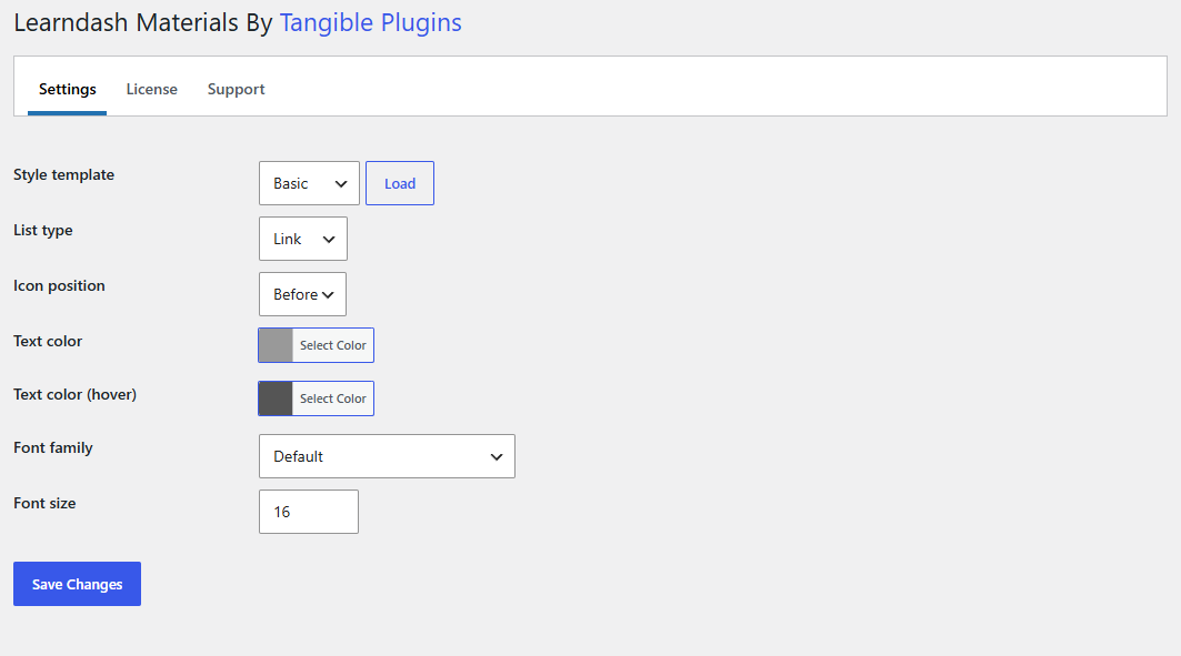
The look of the materials list is a single site-wide setting: every course, lesson, topic, and quiz renders its list the same way. Configure it at Settings > Learndash Materials on the Settings tab.
Start from a preset
The Style template dropdown at the top offers three presets. Choose one and click Load to fill the fields below with the preset's values, then adjust anything you like and click Save Changes.
| Preset | List type | Look |
|---|---|---|
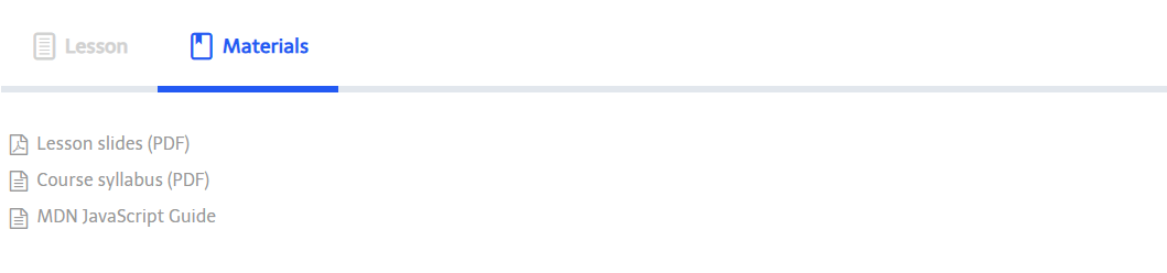
| Basic | Link | A plain vertical list of grey links that darken on hover. The default until you save something else. |
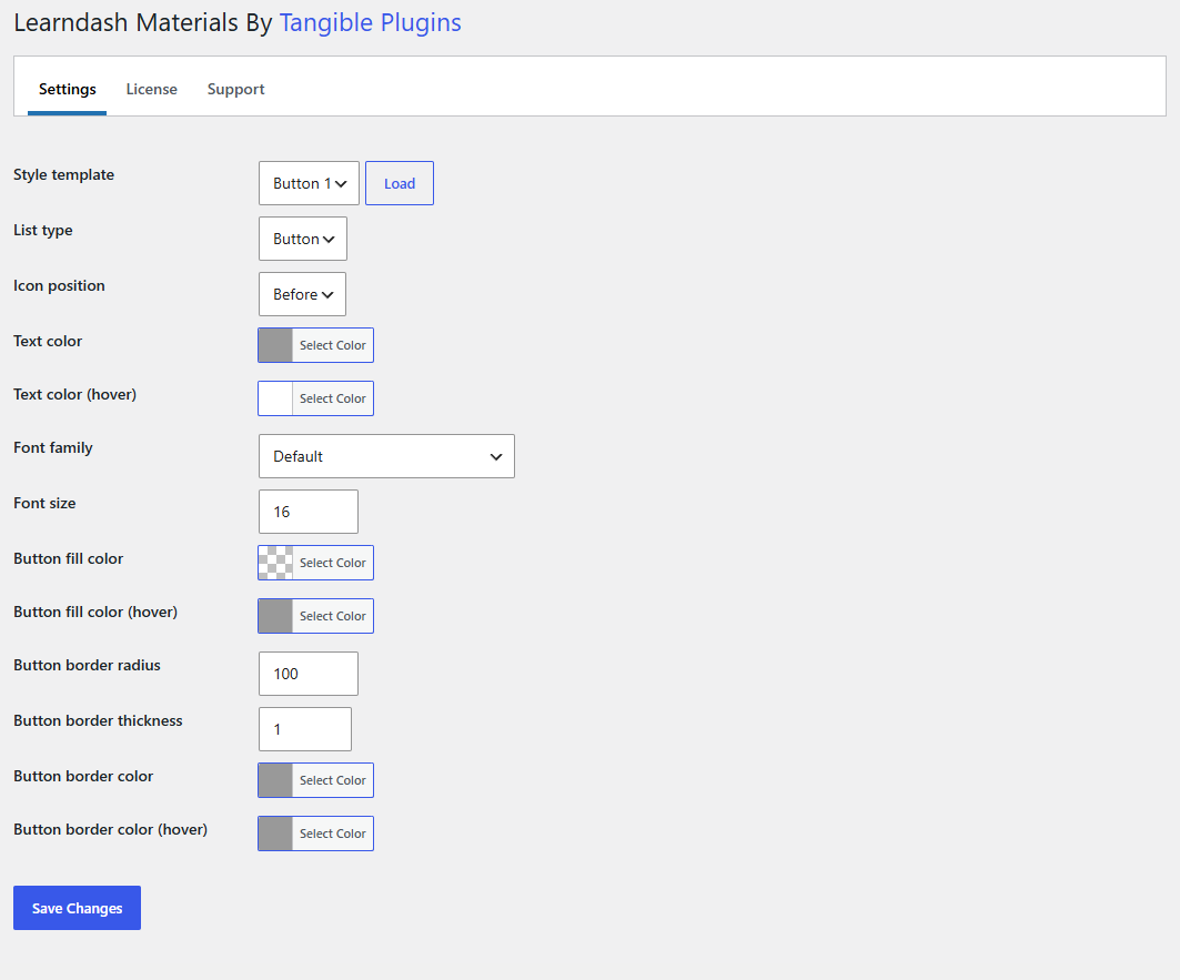
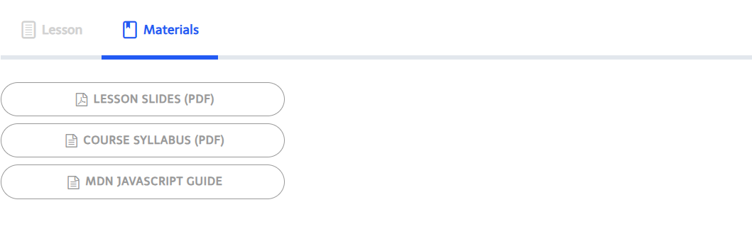
| Button 1 | Button | Outlined pill buttons: grey text and border on a transparent fill; the fill turns grey and the text white on hover. |
| Button 2 | Button | Filled pill buttons: white text on a grey fill that darkens on hover. |
Load only fills the fields; nothing is applied until you click Save Changes. And it only sets the fields a preset defines: the Basic preset does not touch the button colours, so if you switch from a button preset back to Basic and later flip List type to Button by hand, you may get button colours left over from before. When you want buttons, load a button preset.
The settings
| Setting | Options | What it controls |
|---|---|---|
| List type | Link, Button | Plain links, or each material as a full-width pill button. Choosing Button reveals the button settings below. |
| Icon position | Before, After | Whether the file-type icon sits before or after the title. |
| Text color | colour | Link or button text colour. |
| Text color (hover) | colour | Text colour on hover and keyboard focus. |
| Font family | Default, or a Google Font | Default inherits your theme's font. Choosing a Google Font loads it from Google Fonts on pages that show materials. |
| Font size | 0 to 100 (px) | Text size of the list. |
| Button fill color | colour | Button background. Button list type only. |
| Button fill color (hover) | colour | Button background on hover and focus. |
| Button border radius | 0 to 100 (px) | Corner rounding; 100 gives the pill shape. |
| Button border thickness | 1 to 10 (px) | Border width. |
| Button border color | colour | Border colour. |
| Button border color (hover) | colour | Border colour on hover and focus. |
Colour fields open the WordPress colour picker with an extra transparency slider, so a fill can be semi-transparent or fully transparent (the Button 1 preset uses a fully transparent fill).
What the two list types look like
Link:
Button (Button 1 preset):
Notes
- Styles apply everywhere the list renders, in the Materials tab and anywhere you place the shortcode.
- The Font family option makes a request to Google Fonts from the visitor's browser. If your privacy policy avoids third-party font loading, leave it on Default.
- For anything beyond these settings, target the list's CSS classes from your theme; see 8.3 Shortcode and CSS Reference.