Profile Edit Form
Profile Edit Form
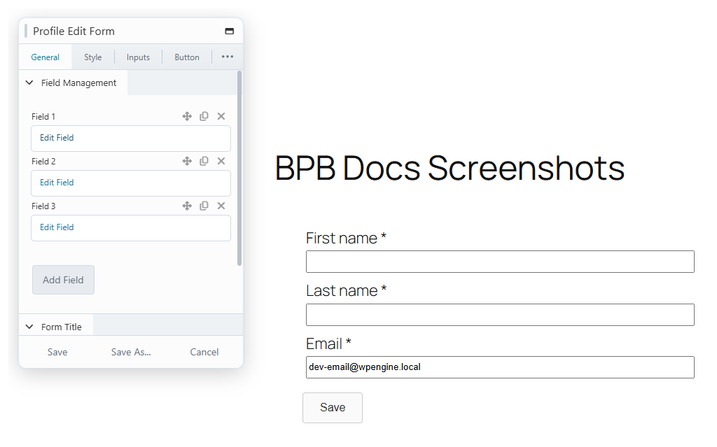
Renders a form where the currently logged-in user edits their own profile. You choose the fields, their order, and their behaviour; the form saves over AJAX without a page reload.
Usage
Account details page — The standard use: a members-only page where users maintain name, email, password, and biography. Pair with the Avatar Edit module for a complete account page.
Profile completion for a community or LMS site — Add custom fields pointing at the user meta keys your community, membership, or LMS plugin reads, so users can maintain that data from the front end.
Password-change page — A minimal form with only Current password and Change Password fields; see How to Let Users Change Their Password.
How it works
| Situation | Behaviour |
|---|---|
| Standard field saved (name, email, website…) | Written to the WordPress user record. |
| Custom field saved | Written to user meta under the configured meta key. |
| Current password field present | The save is rejected unless the entered password matches the user's current password. |
| Change Password left blank | The password is unchanged; other fields still save. |
| New password and confirmation differ | The save is rejected with an inline error. |
| A required field is empty | Inline validation blocks submission; each field's error message is configurable. |
Settings
General
| Setting | Description |
|---|---|
| Field (repeatable) | The form's field list. Each entry opens the field management form below. Drag to reorder. |
| Enable Title | Shows a title above the form, with text and heading tag options. |
Per-field settings (each field row)
| Setting | Description |
|---|---|
| Field | Which profile field this row renders. See Built-in Form Fields. |
| Label | The label shown on the form. |
| Placeholder | Placeholder text inside the input. |
| Required field | Whether the field must be filled. Nickname, Email, and Current password are always required. |
| Error message | The inline message when validation fails for this field. |
| Meta Key | Custom field only — the user meta key the value is stored under. |
| Custom Field Types | Custom field only — the input type. Text by default; more types available via the bpb_custom_field_types filter. |
| Date/Time Format, Timepicker Step | Date picker and time picker types only — display format and time increments. |
| Options fields | Select, radio, and multi-checkbox types only — one option per row as value|||Label. |
| Multiselect / Show Select All | Select and multi-checkbox types only — allow multiple selections, or offer a select-all control. |
| Show strength indicator, Minimum password strength level | Change Password only — enforce a minimum strength using the WordPress meter. |
| Show confirmation field | Change Password only — require the new password to be typed twice. |
| Title, Tag, Wrap in fieldset | Title field only — heading text, HTML tag, and whether following fields are wrapped in a fieldset until the next title. |
| Style (per field) | Field-level color, border, placeholder, and label overrides on the field's Style tab. |
Style
| Setting | Description |
|---|---|
| Form Background | Background color or image, with size and repeat options. |
| Form Border | Border style for the form container. |
| Padding | Inner spacing of the form. |
| Title | Margin around the form title. |
Inputs
| Setting | Description |
|---|---|
| Colors | Text and background colors for inputs. |
| Border | Input borders and the focus border color. |
| Size & Alignment | Heights for inputs, selects, and textareas. |
| General | Input padding and spacing between fields. |
| Placeholder | Show or hide placeholders and set their color. |
| Label | Show or hide labels and the required "*" indicator. |
Button
| Setting | Description |
|---|---|
| Text / Loading Text | The save button label, with an optional label while saving. |
| Icons | Optional button icon, loading icon, and icon position. |
| Button Colors | Background, text, and border colors for normal, hover, and loading states. |
| Button Structure | Width, alignment, padding, and top margin. |
| Typography | Button font settings. |
Messages
| Setting | Description |
|---|---|
| Errors | Colors for inline error messages and error field borders. |
| Success Message | The message shown after a successful save, and its color. |
Typography
| Setting | Description |
|---|---|
| Title / Label / Input / Error / Success Message | Font settings and colors for each text element of the form. |
Notes
The field picker only shows fields when you are logged in while editing, which is always the case inside Beaver Builder.