Avatar Edit
Avatar Edit
Renders a trigger element that opens a popup where the currently logged-in user uploads, crops, rates, and confirms a new profile picture.
Requires Simple Local Avatars
Avatars are stored through the free Simple Local Avatars plugin, which must be installed and active.
Usage
Account page avatar control — Place next to the Profile Edit Form with the trigger set to Image Button and the image connected to User Picture: users see their current avatar and a "Change photo" button.
Minimal inline control — Set the trigger to a small Icon (for example a pencil) overlaid on a profile layout where space is tight.
How it works
| Situation | Behaviour |
|---|---|
| User confirms an upload | The cropped image is saved to the media library as a PNG and set as the user's avatar via Simple Local Avatars. |
| User had a previously uploaded avatar | The old image is deleted and replaced. |
| A rating is selected or a default rating is set | The rating is stored with the avatar (G, PG, R, or X). |
| Rating checkbox mode, box unchecked | The upload is blocked until the user confirms the checkbox. |
Settings
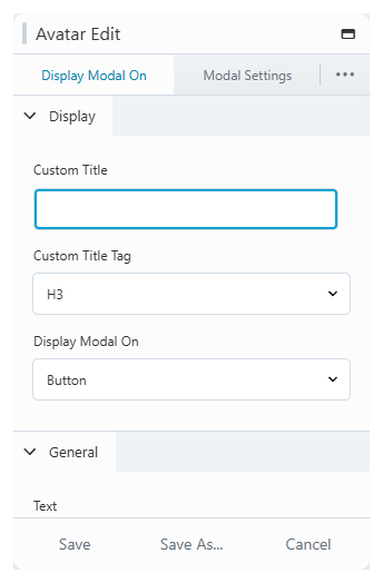
Display Modal On
| Setting | Description |
|---|---|
| Custom Title / Tag | Optional heading rendered above the trigger. |
| Display Modal On | The trigger type: Icon, Image, Text, Button, Image Icon, Image Text, or Image Button. |
| Alignment | Trigger alignment. |
| Icon | Icon choice, size, color, and hover color (icon triggers). |
| Image | The image, crop shape, where the companion icon/text/button sits (below, on photo, on photo hover), and an optional blur when overlaid (image triggers). Connect the image to User Picture to show the current avatar. |
| Text | Trigger text with color, hover color, and typography (text triggers). |
| Button | Full button styling: text, icon, border, colors, width, and typography (button triggers). |
Modal Settings
| Setting | Description |
|---|---|
| Title | The popup title, its alignment and padding. |
| Subtitle | The per-screen subtitles ("01. Upload", "02. Crop / Preview", "03. Rating / Result") and their styling. |
| Image Rating - Screen 3 | Rating selection mode (dropdown, checkbox, or none), the default rating, and the checkbox text. |
| Modal Buttons | Labels and colors for the Prev, Next, and Upload buttons, corner rounding, and padding. |
| Modal Popup Setting | Popup width and height, background color, content padding, and whether ESC or an overlay click closes it. |
Modal Typography
| Setting | Description |
|---|---|
| Modal Title / Subtitle / Rating / Button | Tag selection, font settings, and colors for each popup text element. |
Notes
info
Uploaded avatars replace the user's previous Beaver Profile Builder upload. Users manage one current avatar, not a gallery.