Style Materials as Buttons
Goal: materials render as full-width pill buttons in your own colours instead of a plain link list.
You need: at least one lesson with materials, so you can see the result.
1. Load a button preset
- Go to Settings > Learndash Materials.
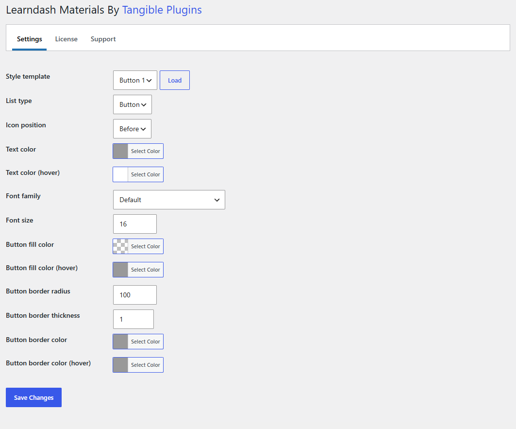
- In Style template, choose Button 1 (outlined) or Button 2 (filled) and click Load. The button fields appear below the font settings.
2. Apply your colours
Work down the fields:
- Text color and Text color (hover): the label colour at rest and on hover.
- Button fill color and Button fill color (hover): the background at rest and on hover. Use the transparency slider in the colour picker for an outlined look.
- Button border color and Button border color (hover): match the fill for a solid button, or the text colour for an outline.
- Button border radius:
100for pills, a small number such as4for gently rounded rectangles,0for square corners. - Button border thickness:
1or2is typical.
Optionally set Font family and Font size, and choose whether the icon sits Before or After the title.
3. Save and check
Click Save Changes, then open a lesson that has materials and click its Materials tab.
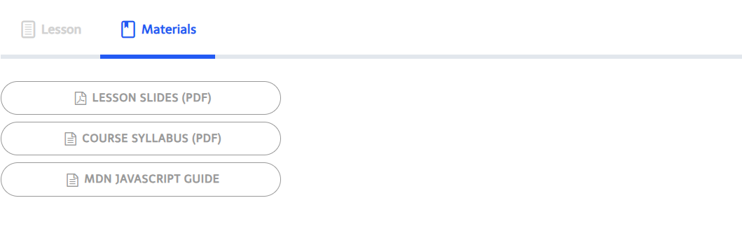
Hover a button to confirm the hover colours read well against your theme's background.
Notes
- Buttons are capped at the list's width (400px by default) and stack vertically. To change the width, add CSS for
.ldash-materialsin your theme; see 8.3 Shortcode and CSS Reference. - The setting is site-wide: every course, lesson, topic, and quiz switches to buttons together.
- To go back to plain links, load the Basic preset and save.